Melody Clark
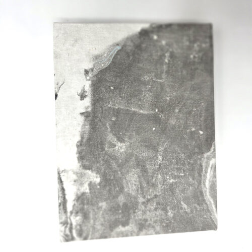
We were delighted to welcome printmaker and book artist Melody Clark to our July meeting. She shared a selection of her beautifully crafted artist’s books, spoke about her creative practice and, inspired by our theme of Grey, created a new book especially for the group.
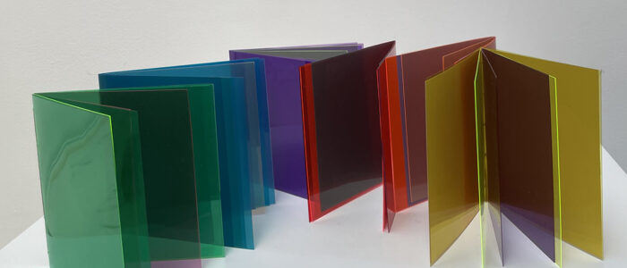
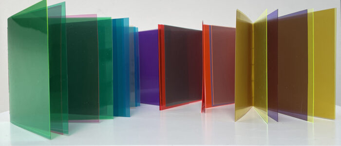
Melody wrote:
“I was very excited to join the LAB meeting as guest artist, and to think about ‘grey’ as subject of an artists’ book.
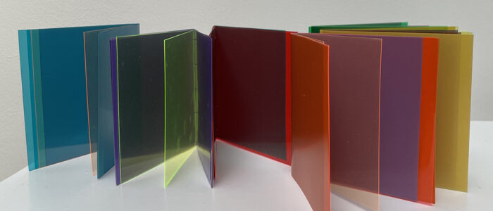
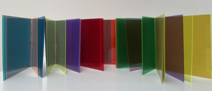
Working with colour theory, l made a series of six books which have bright coloured acetate pages combining to reveal grey in the middle.
“red and green green and red
blue and orange. orange and blue
yellow and purple purple and yellow
“Making these small, simple pamphlet books, taking time to think and look at colour, was informative and sometimes surprising. The books are playful and responsive to light conditions. Each grey is different.
“Thank you so much LAB for inviting me, for the warm welcome, the conversation and the laughter. “
Tony
Thinking of grey my mind went to printmaking. While we strive for the blackest velvety black and sharpest whites, grey is often overlooked.
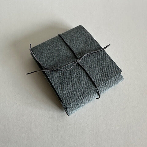
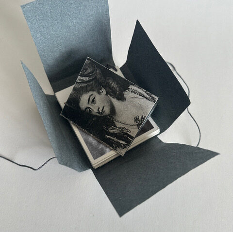
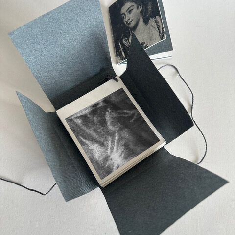
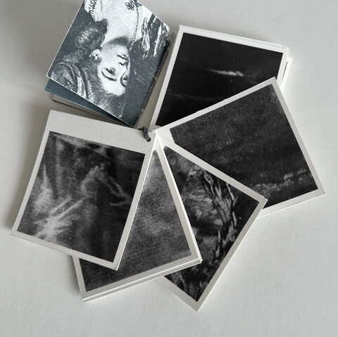
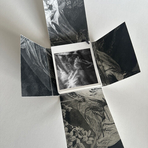
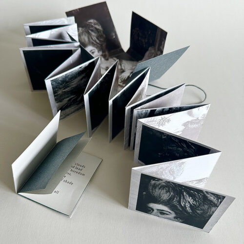
Mezzotint was developed in the 18th century to give the most subtle of grey tones and was the preferred method for the reproduction of paintings until lithography was invented. At Neckinger we have a collection of fantastic mezzotints depicting socialites painted by Joshua Reynolds. I used photos taken from the prints to give a of ranges of greys which I tied together as a sample book. I created a small pamphlet stitched book using the image of Mrs Bamphylde created to celebrate her ultimately unhappy marriage. I then wrapped them all in an Indian grey kardi paper wrapper.
… and then I made a concertina!
The words in the book can be found here.
Alison
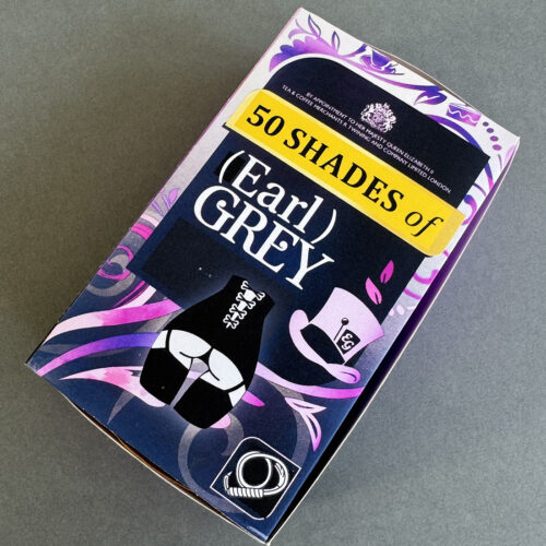
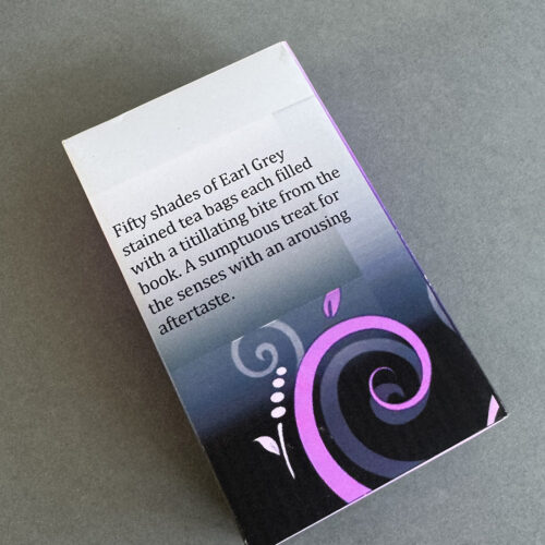
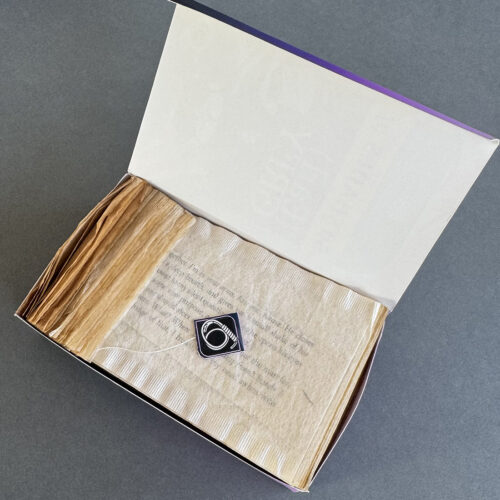
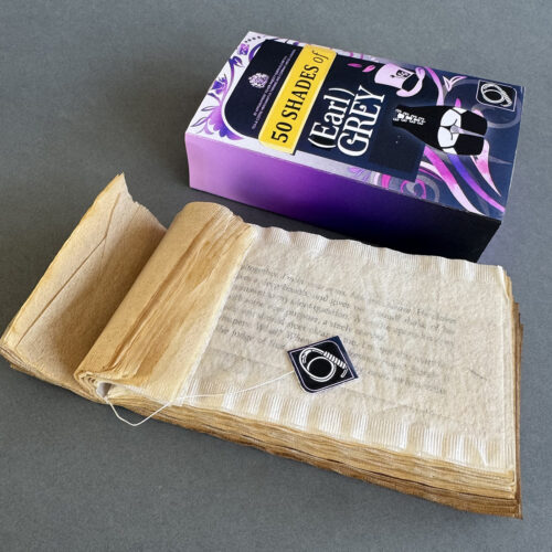
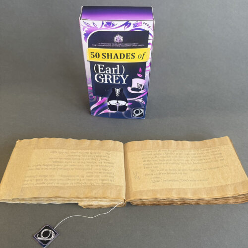
I couldn’t help think of the book 50 Shades of Grey for this project. The combination of proper Earl Grey tea and reading a naughty book amused me so here are 50 saucy snippets from the book, each housed in a tea bag dyed a shade of grey using Earl Grey tea. I hope Twinings won’t mind some not-so-subtle changes I’ve made to their packaging design.
Dawn
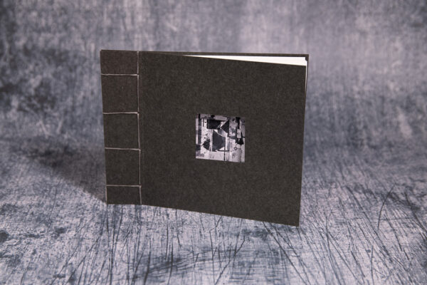
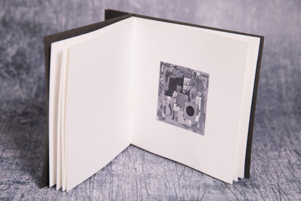
‘Grey’ proved a thoughtful challenge, given my usual predilection for colour. It asked for
restraint, and I decided the book should answer in kind: quiet, controlled, intimate. Pages
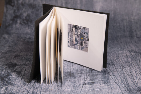
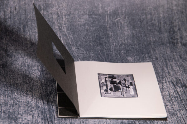
you have to lean in close to in order to make out the small collages hidden within. A simple
Japanese stab binding felt right for this low-key approach, just plain grey thread holding
ideas together.
Then the first twist: deep into the sequence, small specks of colour begin to surface.
However small the colour pops amidst the tones of grey. The second twist is quieter, and
stranger. Every collage in this book was made by a machine. It’s a commentary, gently
posed, on the possibility of a singularity, that moment when machines might gain something
like creativity of their own. The only prompt I gave the machine was “a collage in
grey.” Looking at the results, I think you can catch echoes of Schwitters, Rauschenberg and
others, ghosts in the grain, posing questions of reproduction, replication and appropriation.
The collages pose questions about what creativity is and where we might all be headed.
Isi
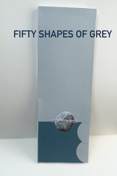
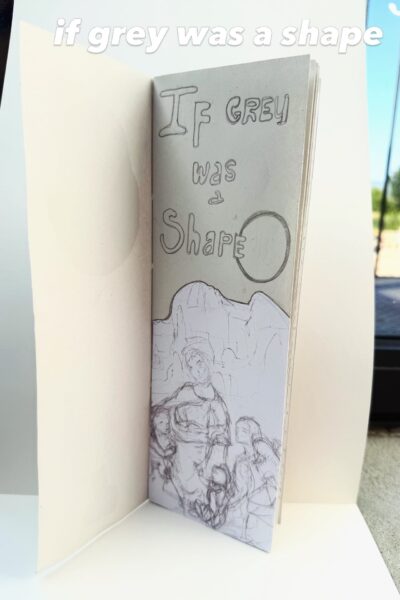
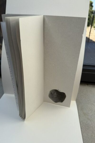
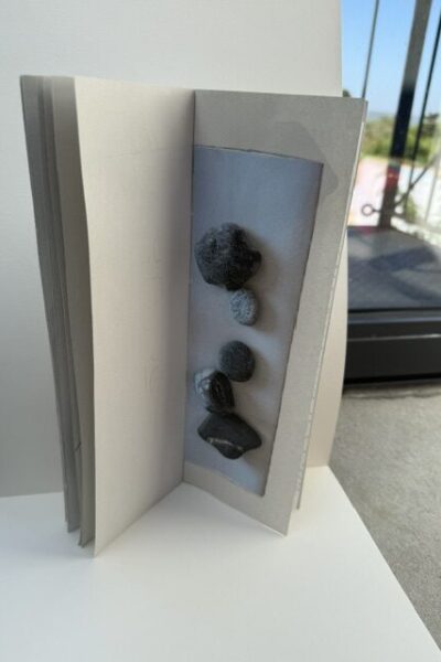
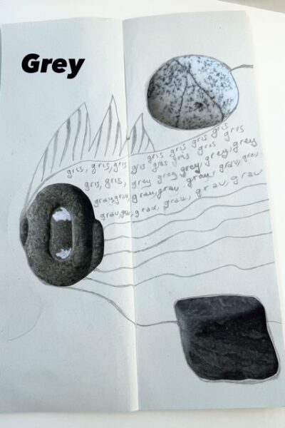
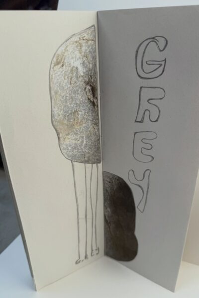
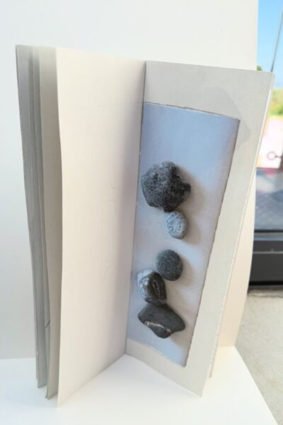
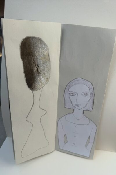
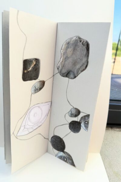
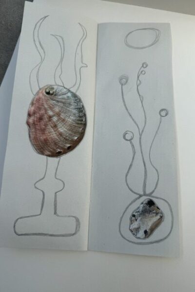
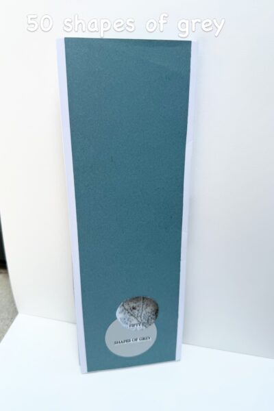
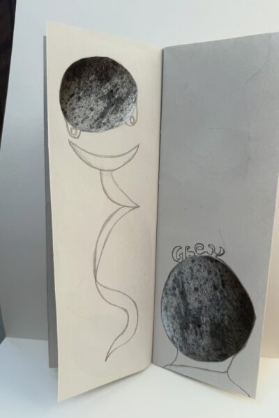
What if grey were a shape ?
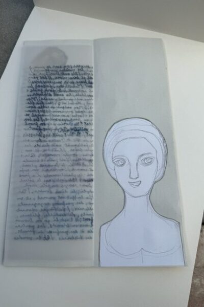
The colour grey reminds me of pebbles, or stones, round shapes and faces drawn with graphite pencils.
Here I enjoyed taking the concept of a colour and turned it into a form, some kind of structure floating in our imagination. Of course, I couldn’t resist giving this little fun book the title of “Fifty shapes of grey.
Joan
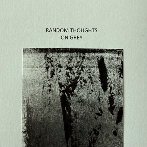
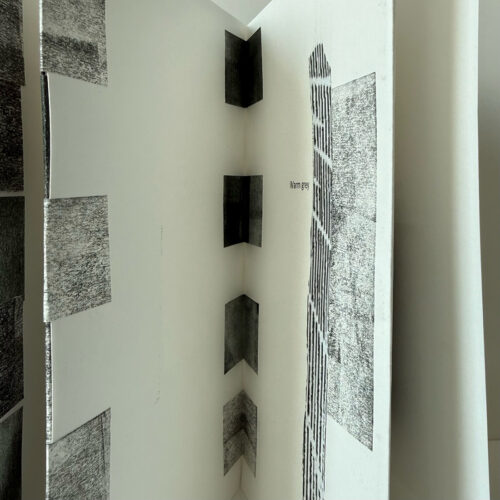
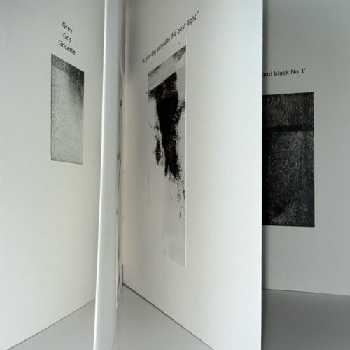
I wanted to try a new (to me) structure for this book, so I made a tab binding. It worked quite well, except I made a mistake counting tabs! The images are offcuts from recent prints. I find it difficult to throw away little squares with interesting marks, often made when cleaning my rollers after a day making prints. I was unsure how to respond to our theme of Grey and decided to write down some random thoughts and first ideas that came to mind – hence the title.
Patti
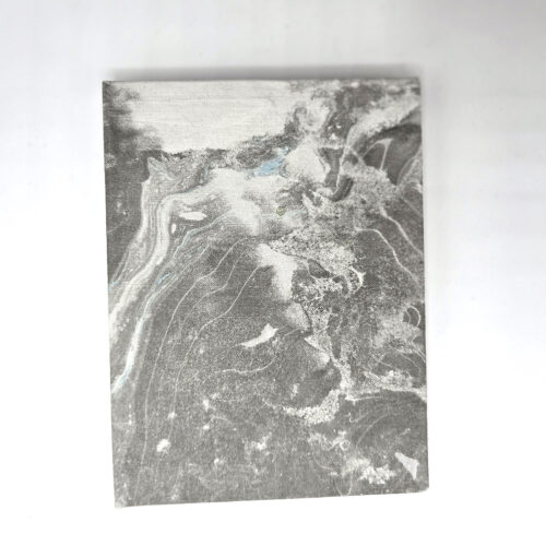
This book began with the suminagashi bookcloth and endpapers I printed during a course with Sue Doggett at City Lit. These prints sparked a continuing series of books inspired by the sea. Elements such as the Beaufort Scale, the Shipping Forecast and a ship’s log have become starting points for poetry and prose exploring the loss of a relationship and the fragility of memory.
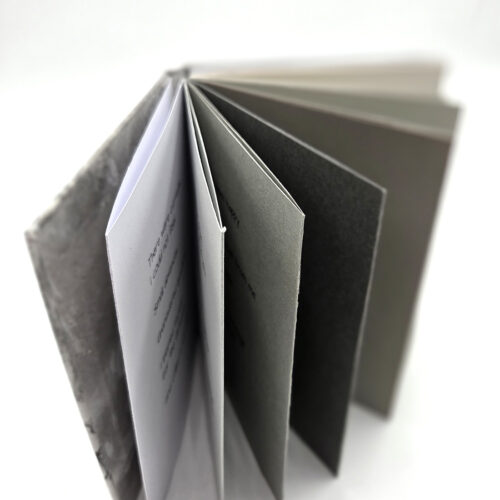
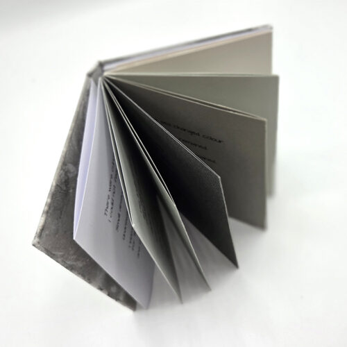
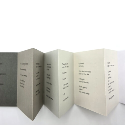
When the theme Grey was chosen, I immediately thought of the sea in all its changing moods. I wrote a poem (which you will find here) to reflect the shifting emotions suggested by the different shades of grey paper.
The book is a concertina structure made from a range of grey papers, with boards covered in suminagashi-printed paper and Chinese shogi paper used for the endpapers. The quality of grey papers was dictated by time constraints, but their varied tones echo the changing colours of the sea.