Wendy
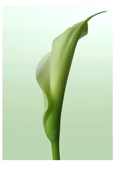
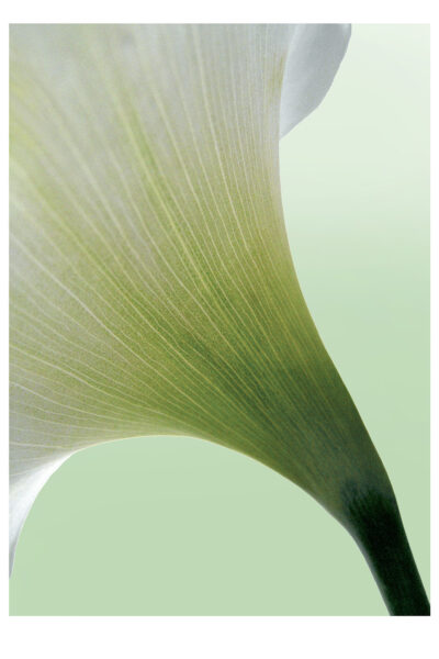
I was considering how much of nature relies on bilateral symmetry for its structure and
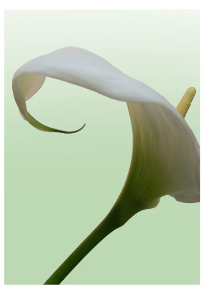
wondering how to incorporate some aspect into this theme, when I looked at my arum lilies
and had a small eureka moment (not in the bath). Their beauty relies so much on their
asymmetry that I had found my subject.
Six photographic images and one Mary Oliver quote. Unbound book printed on high white
100% cotton paper in Khadi wrapper.
Alison
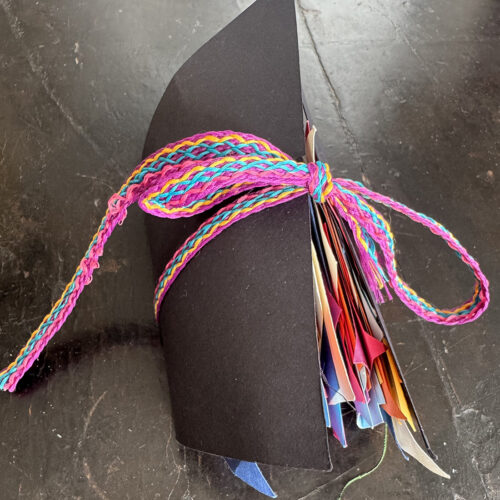
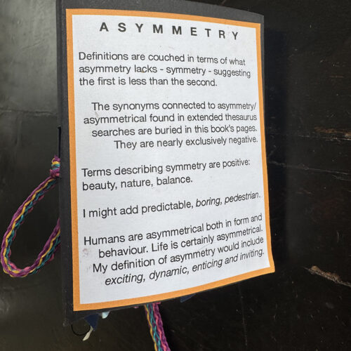
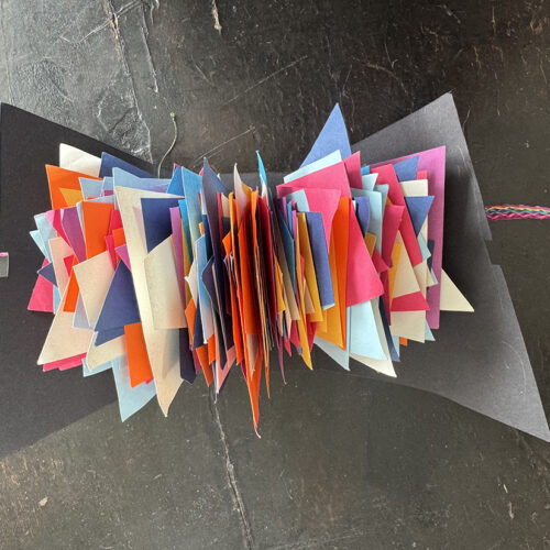
What could be more symmetrical then a traditional book format? For this theme I wanted to challenge that presumption and create a book that had asymmetry as its central premise. Buried in its pages are synonyms I found for asymmetry, which are often surprisingly negative. Why would asymmetry be considered a negative attribute?
Dawn
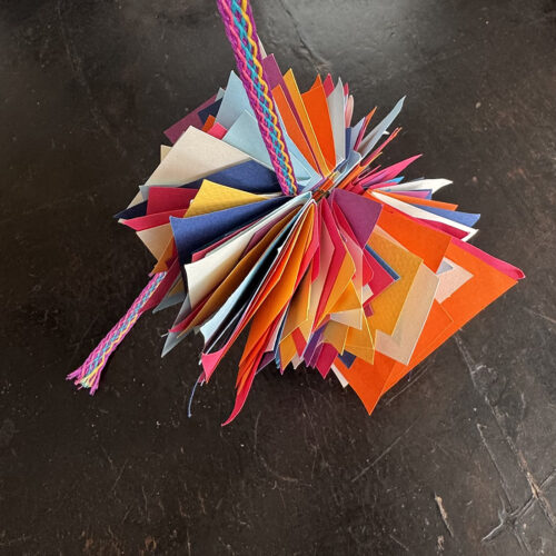
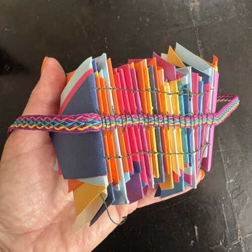
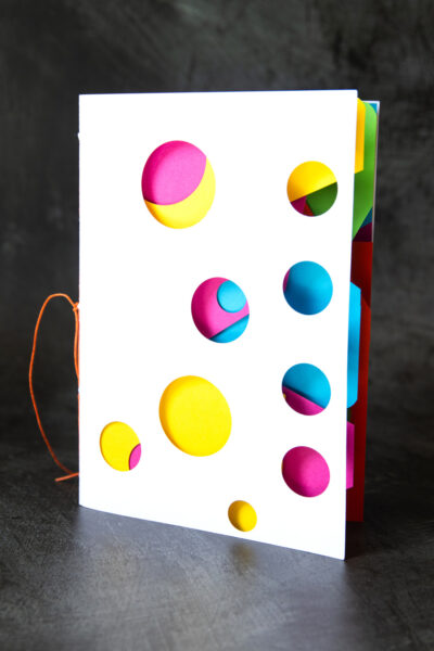
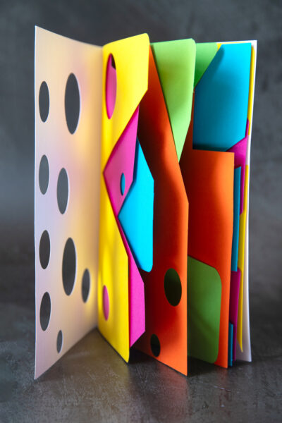
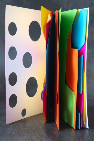
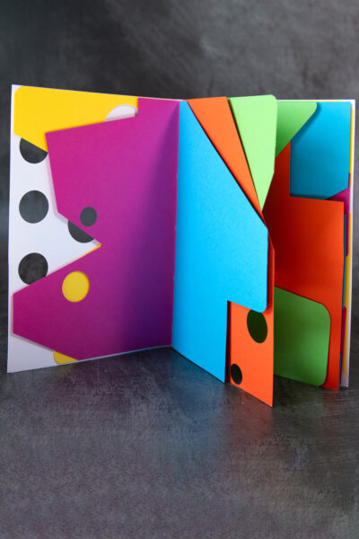
‘Asymmetry’ gave me a chance to let my imagination flow freely. Manifest in this simple
pamphlet-stitched book in colour and shape alike, a form I’ve played with before, but this
was an opportunity to push it further. It was also a convenient way to work through my
growing scrap pile of coloured off-cuts!
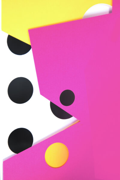
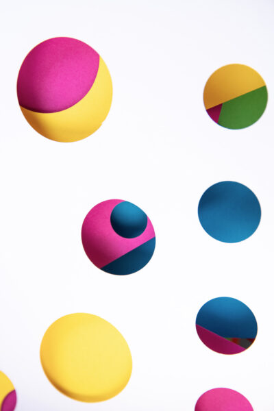
Punching holes off-centre and cutting different angled signatures meant the asymmetries
reveal themselves as you turn each page, often playing deliberately with complementary
colours to make them as impactful as possible. It carries no specific meaning, it’s simply a
joyful exploration of shape, form, and colour.
Gill
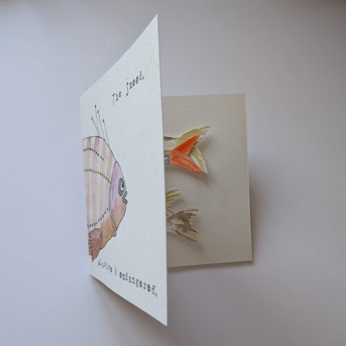
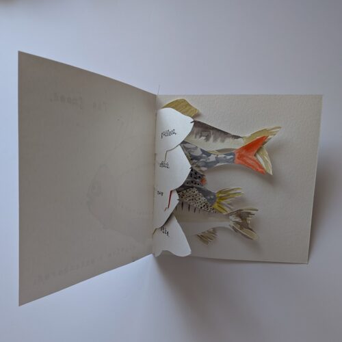
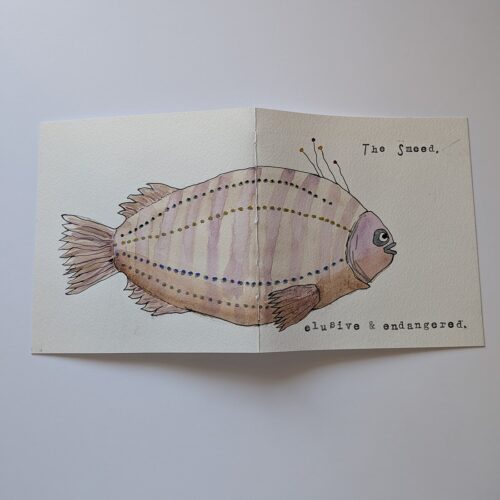
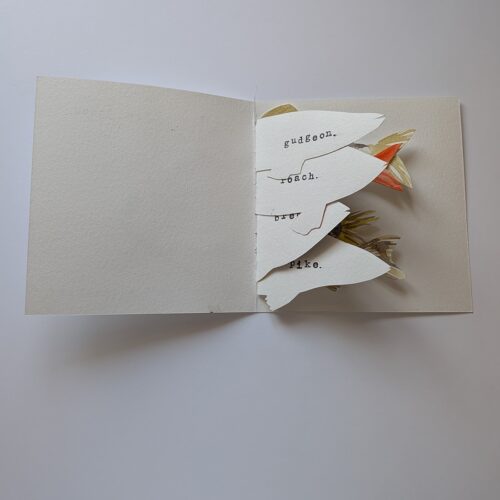
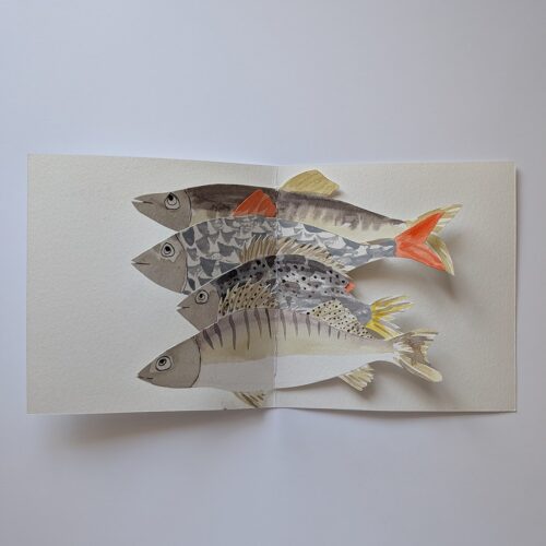
For the theme of Asymmetry I chose to make a book with pages of all different shapes and sizes. The subject of fish comes from our group visit to Fish Island in Hackney Wick, and is a comment on the type of fish that used to live in the canal there; it’s not certain that they all still do or how many there are.
Isi
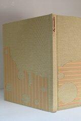
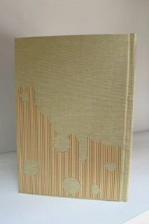
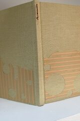
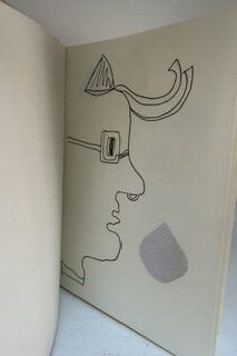
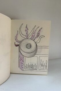
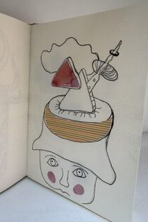
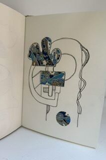
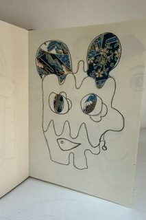
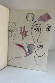
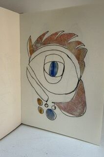
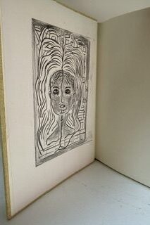
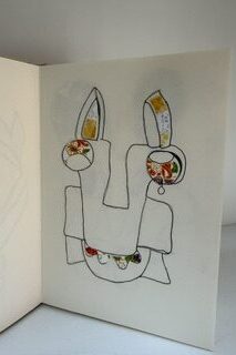
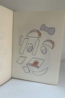
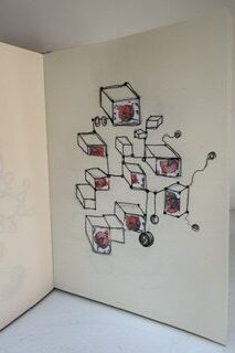
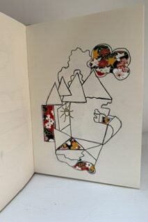
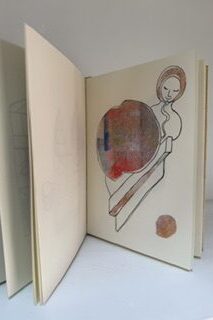
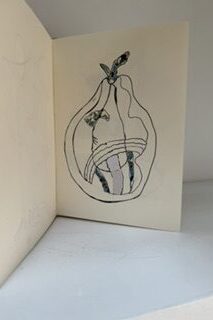
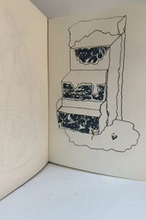
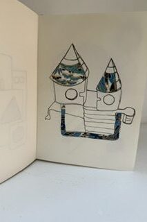
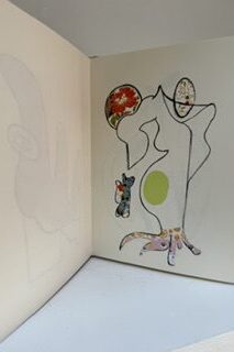
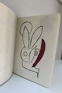
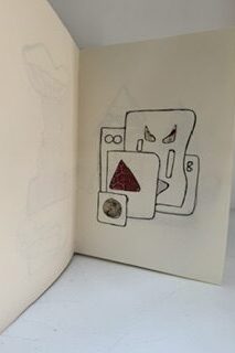
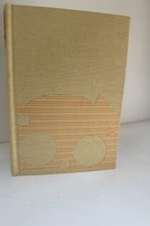
For this month’s theme, asymmetry, I did not use any words in this artist book. A first for me, even if I generally work on themes around discourse! This time I challenged myself to illustrate this theme by drawing asymmetric shapes mixed with collage.
Joan
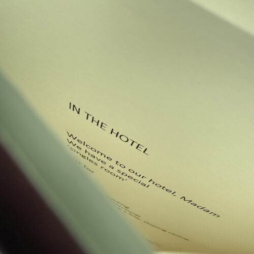
I have been making a second, updated, edition of my book ‘Single Supplement’.
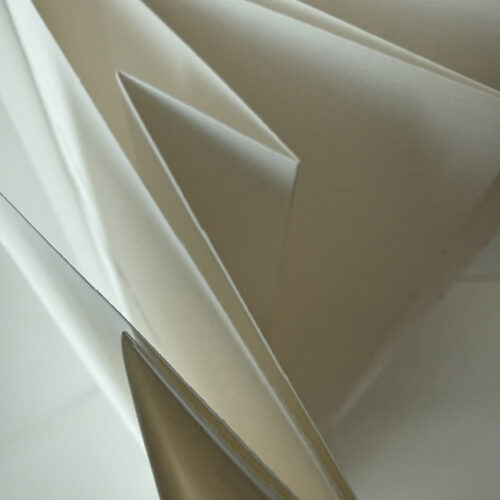
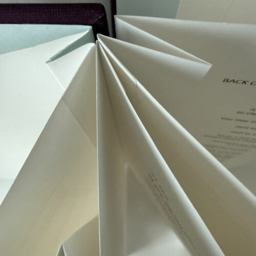
It’s about the experience of travelling alone and it is about the poor treatment meted out to solo travellers and people dining or drinking on their own. Hotels and shipping lines routinely charge guests extra for their stay in the smallest, most miserable, rooms and cabins – it’s known as the ’single supplement’. I have made an irregular concertina book because I wanted to have some narrow pages and hidden folds to represent the cramped, unpleasant places often reserved for solo travellers in hotels and restaurants. There is a distinct asymmetry, not just in the experiences of solo travellers/diners and couples or families, but in the power relationships between customers and hotel and restaurant owners. In 2023, the Café Royal in London decided to charge solo diners twice as much as they would normally pay, on the basis that they were losing significant revenue when people eating on their own took up a table for two.
Patti
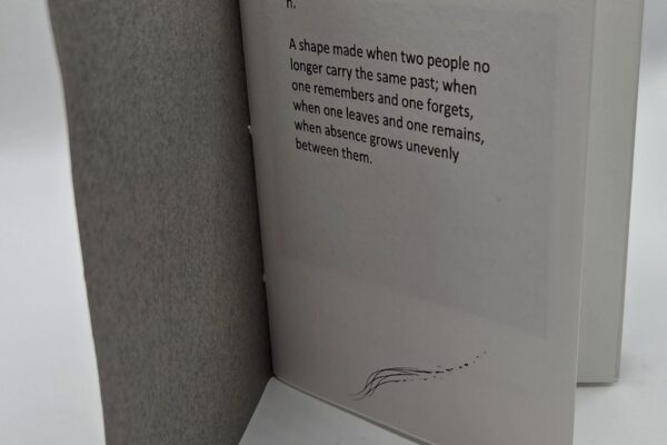
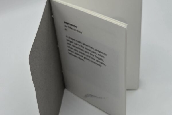
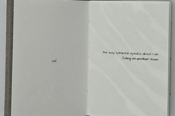
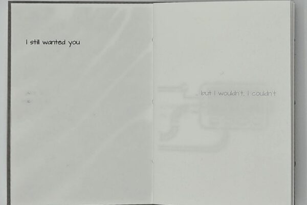
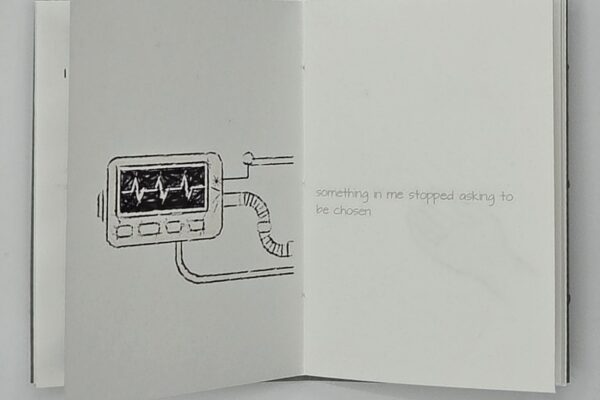
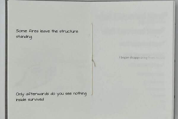
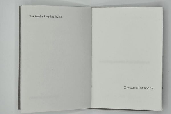
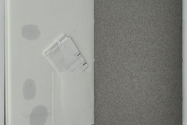
I decided to look at Asymmetry from a different perspective – that of relationships going awry. Based on my poem, Burn, it is scattered with text and hand drawn and photographic images, some distorted. The poem itself is folded and locked with a dagger enclosure (so it cannot be read without being detected) and held in a small pocket on the last page.
Dos-à-dos binding on Fabriano paper with Canson Mi-Teintes paper cover.
Tamar
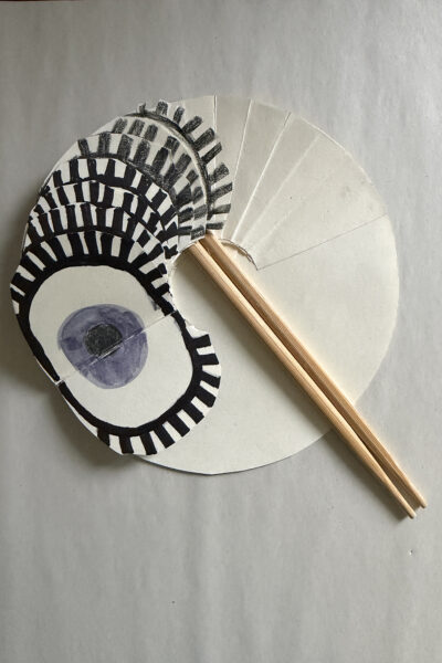
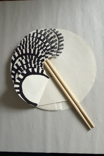
Wink, Wink
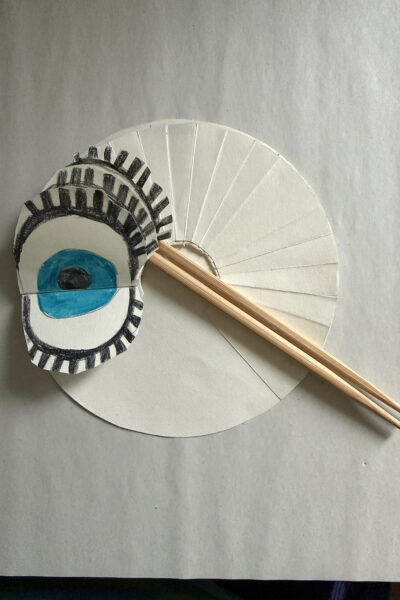
When thinking about asymmetry, I had the idea that when we wink, it makes our face asymmetrical. I was excited to think that the idea would work perfectly with this circular waterfall format, which I’d been itching to try, and thought a cartoon style of drawing would suit such a cartoon idea.
Materials – cream sea white cartridge paper, bamboo chopsticks
Tony
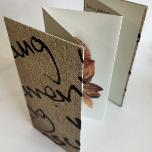
My asymmetry maquette is inspired by an image of a cocoa leaf found in an Inca tomb, part of half a garland and being half is asymmetrical. I combined this with the idea of time passing and the asymmetrical nature of life.
When we’re young our bodies are almost invisible to us, as we age we become more aware of their dis/functioning – aches, pains etc. They become opaque. The poem (which you can read here) discusses what is lost and what is gained as we grow older. One of the pages is pierced allowing the light and colours of the leaf to show through and gives the occasional glimpse of the handwriting on the page behind. I used my own writing as it has a scrappy, asymmetric, feel with suited the theme.
The covers revealed a serendipitous connecting of enlarged hand writing which allied with each other as they were opened out. Tamar observed that the shape and colours made it feel like a historical artefact. Which was a very pleasing comment as a lot of my work revolves around found old objects.