Grey

Melody Clark

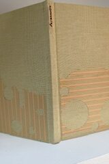
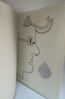
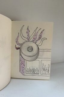
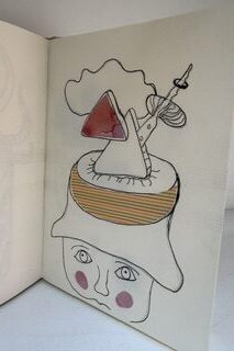
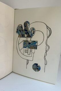
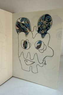
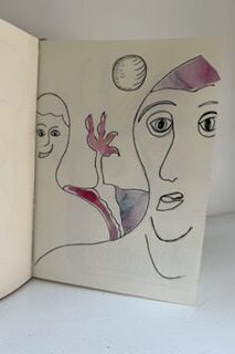
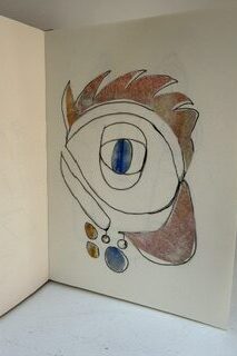
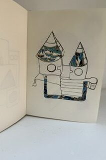
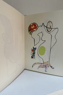
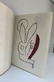
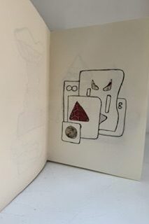
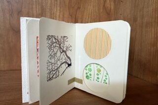
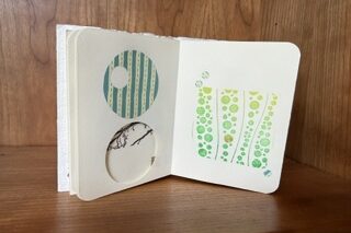
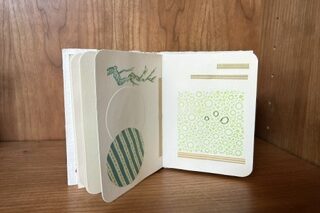
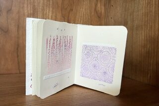
We were delighted to welcome printmaker and book artist Melody Clark to our July meeting. She shared a selection of her beautifully crafted artist’s books, spoke about her creative practice and, inspired by our theme of Grey, created a new book especially for the group.

Melody wrote:

“I was very excited to join the LAB meeting as guest artist, and to think about ‘grey’ as subject of an artists’ book. 

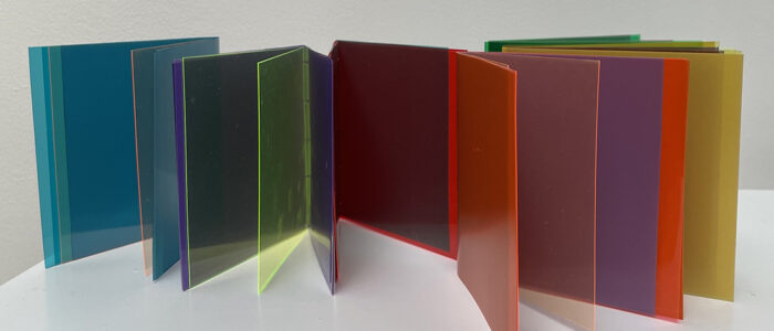
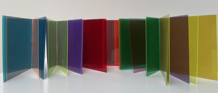
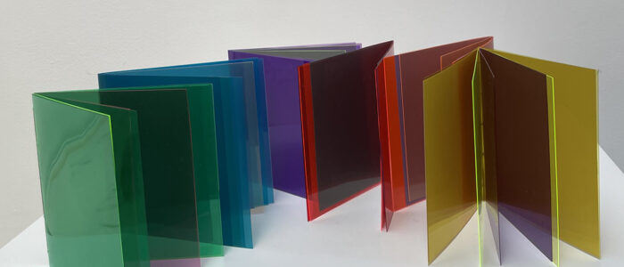
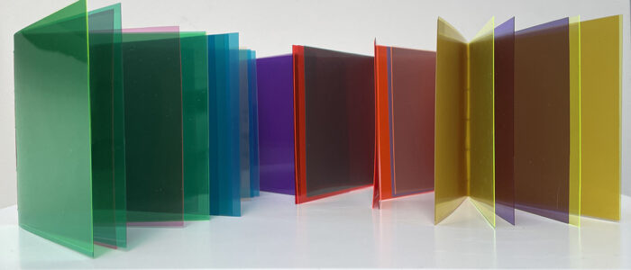
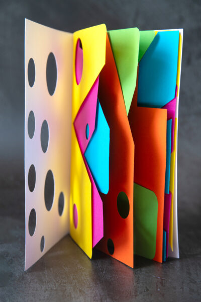
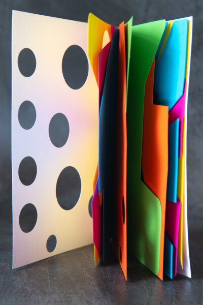
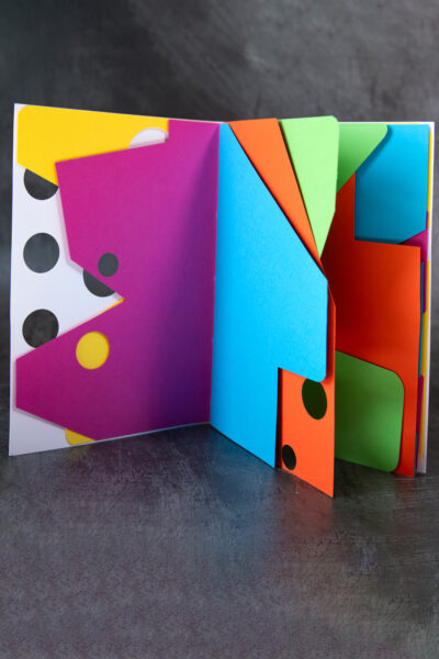
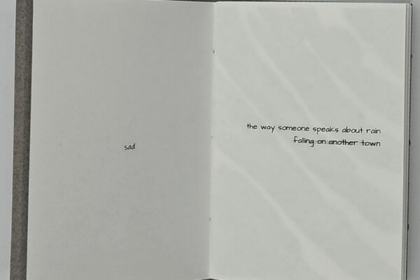
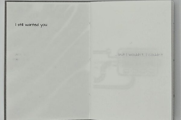
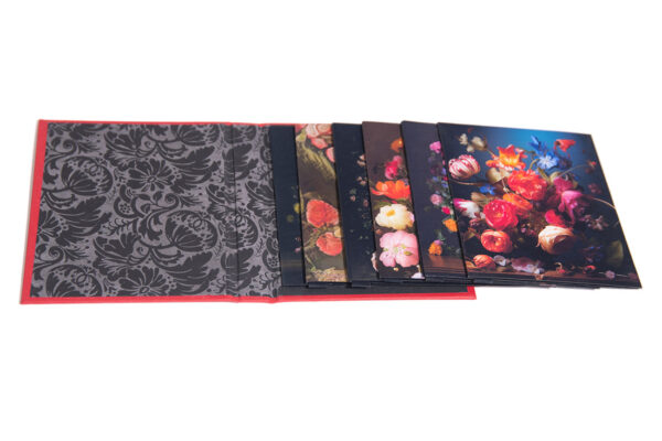
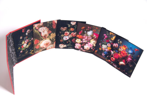
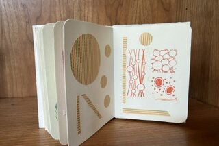
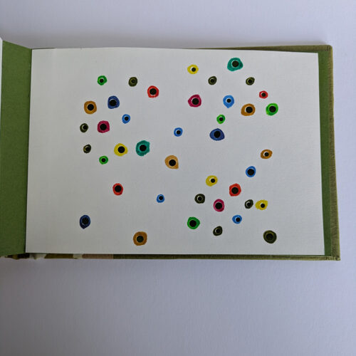
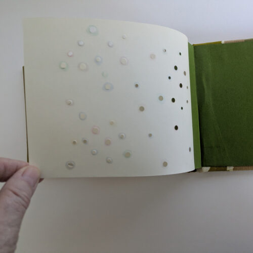
Working with colour theory, l made a series of six books which have bright coloured acetate pages combining to reveal grey in the middle. 

“red and green              green and red
blue and orange.         orange and blue
yellow and purple        purple and yellow 

“Making these small, simple pamphlet books, taking time to think and look at colour, was informative and sometimes surprising. The books are playful and responsive to light conditions.  Each grey is different.

“Thank you so much LAB for inviting me, for the warm welcome, the conversation and the laughter. “

Tony

Thinking of grey my mind went to printmaking. While we strive for the blackest velvety black and sharpest whites, grey is often overlooked. 

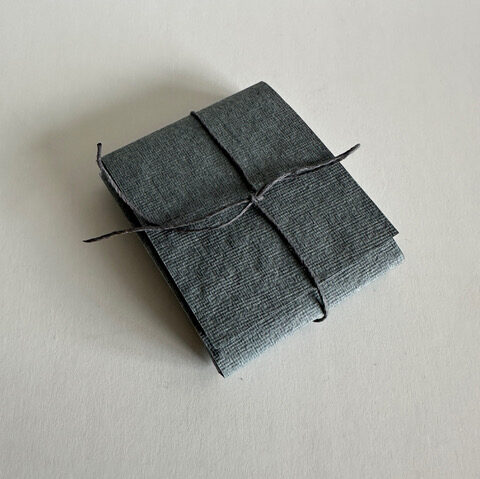
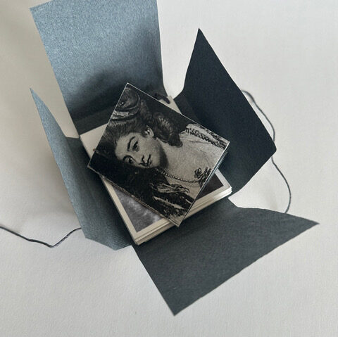
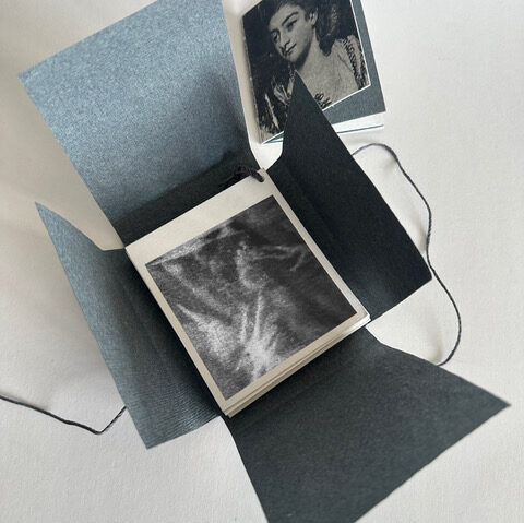
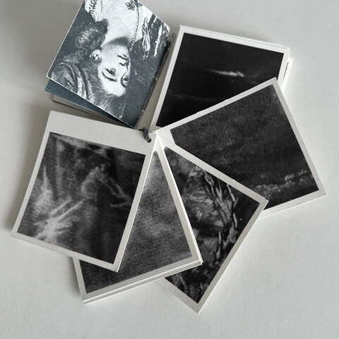
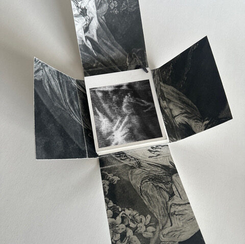
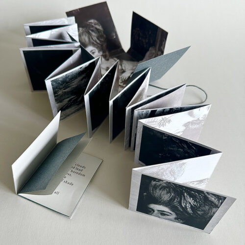
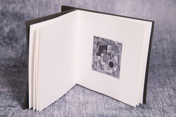
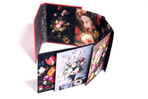
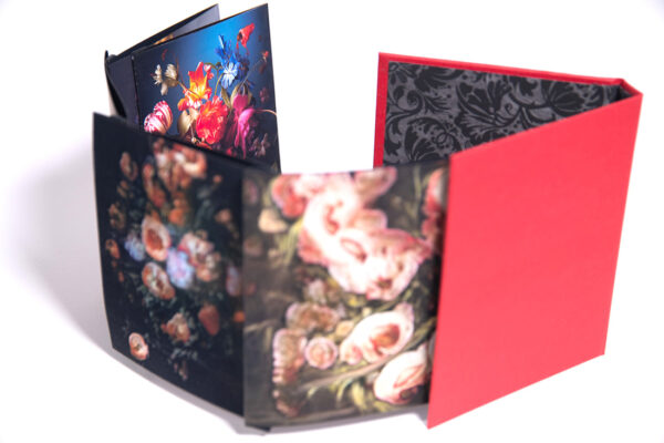
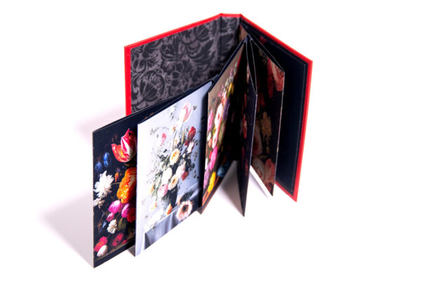
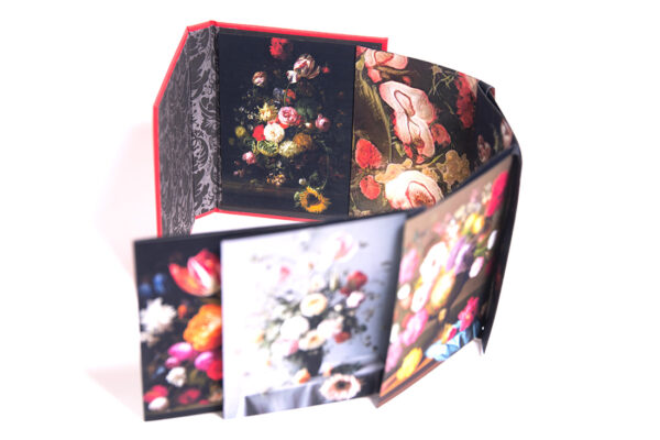
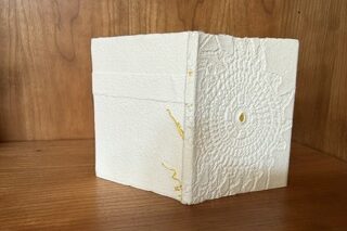
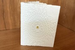
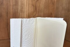
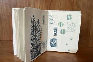
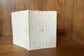
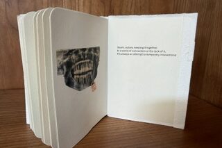
Mezzotint was developed in the 18th century to give the most subtle of grey tones and was the preferred method for the reproduction of paintings until lithography was invented. At Neckinger we have a collection of fantastic mezzotints depicting socialites painted by Joshua Reynolds. I used photos taken from the prints to give a of ranges of greys which I tied together as a sample book. I created a small pamphlet stitched book using the image of Mrs Bamphylde created to celebrate her ultimately unhappy marriage. I then wrapped them all in an Indian grey kardi paper wrapper.

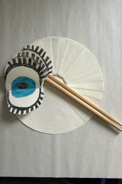
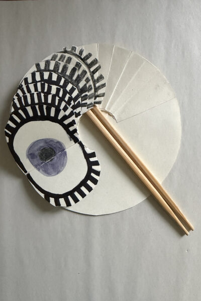
… and then I made a concertina!

The words in the book can be found here.

Alison

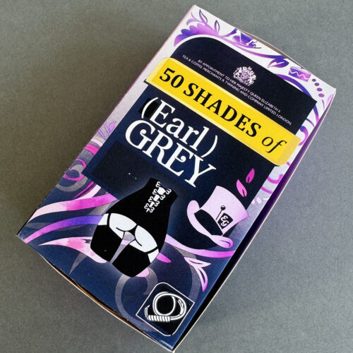
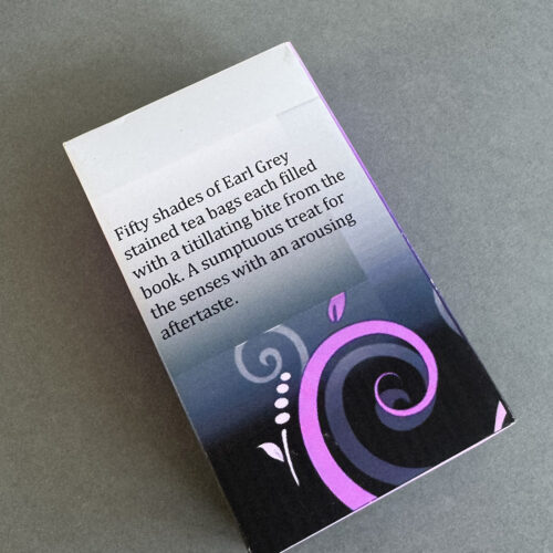
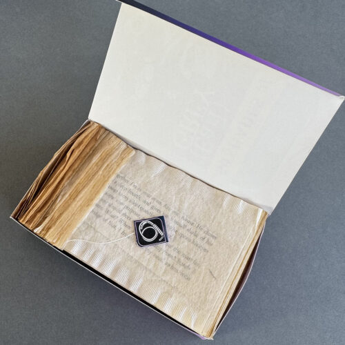
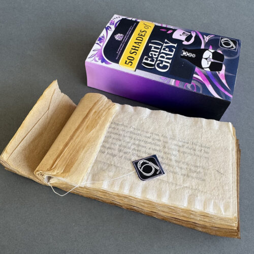
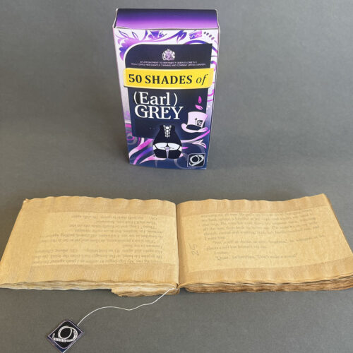
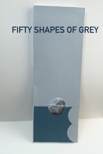
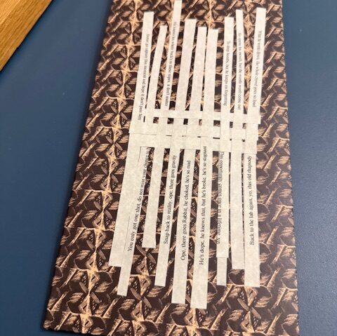
I couldn’t help think of the book 50 Shades of Grey for this project. The combination of proper Earl Grey tea and reading a naughty book amused me so here are 50 saucy snippets from the book, each housed in a tea bag dyed a shade of grey using Earl Grey tea. I hope Twinings won’t mind some not-so-subtle changes I’ve made to their packaging design. 

Isi

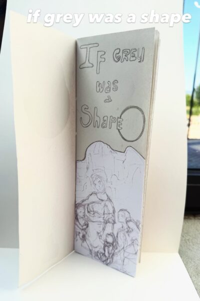
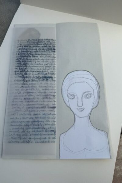
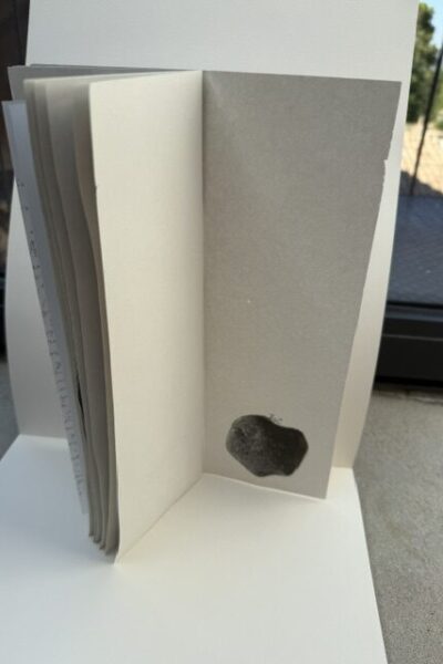
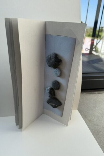
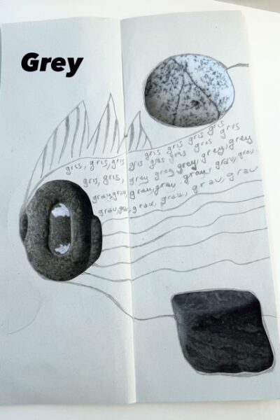
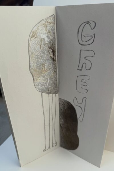
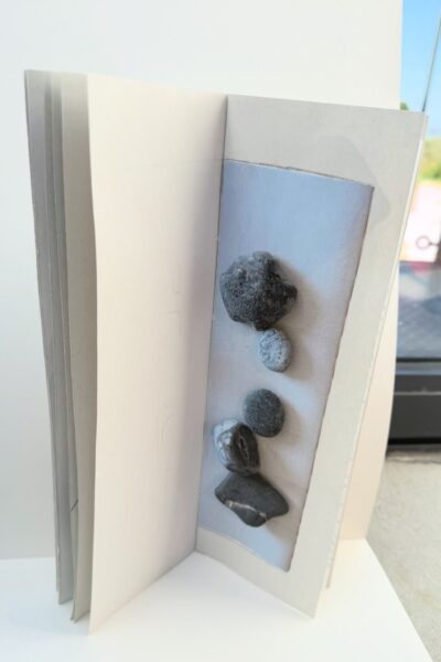
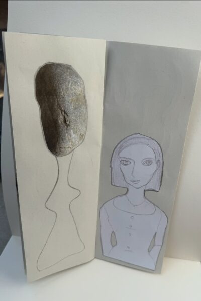
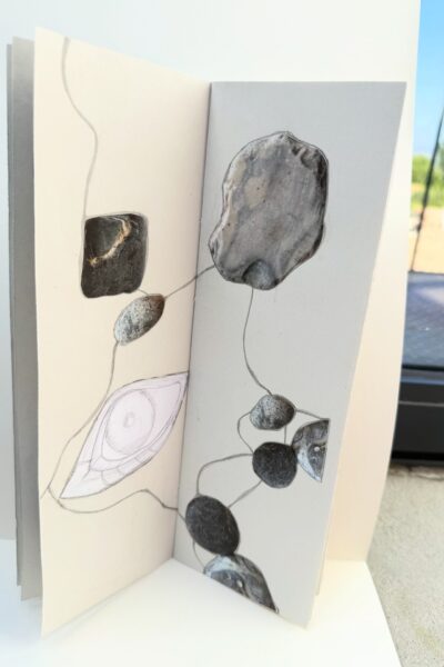
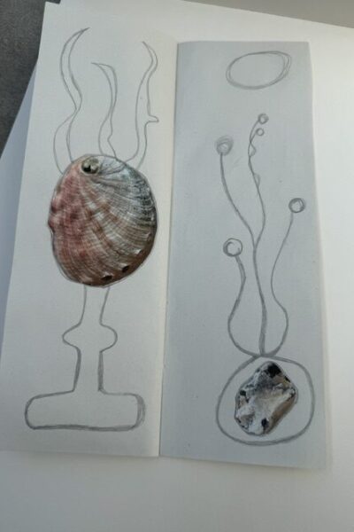
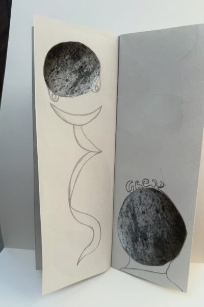
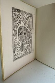
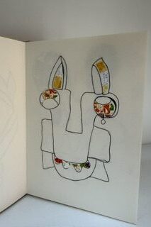
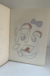
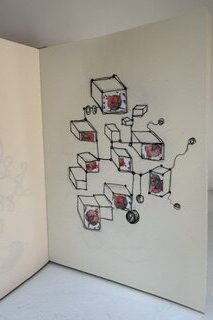
What if grey were a shape ?

The colour grey reminds me  of pebbles, or stones, round shapes and faces drawn with graphite pencils.

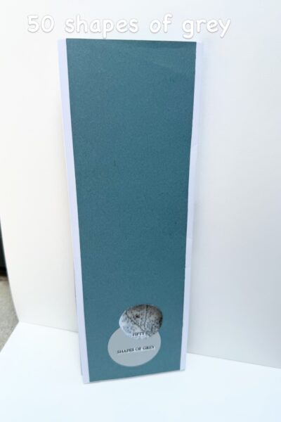
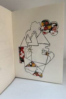
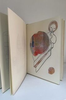
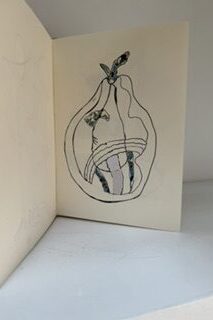
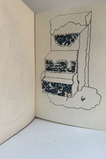
Here I enjoyed taking the concept of a colour and turned it into a form, some kind of structure floating in our imagination. Of course,  I couldn’t resist giving this little fun book the title of “Fifty shapes of grey.

Joan

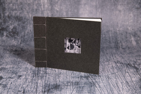
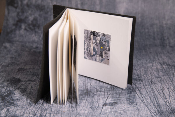
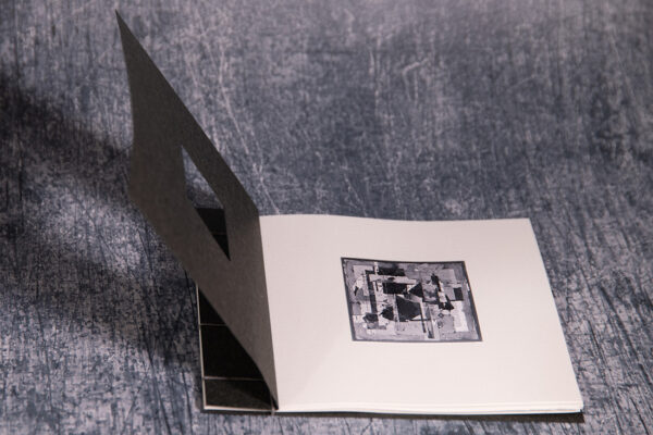
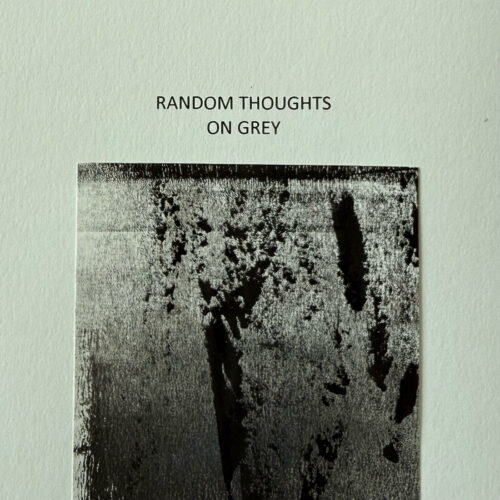
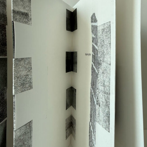
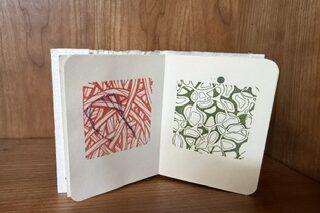
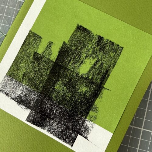
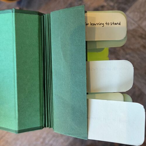
I wanted to try a new (to me) structure for this book, so I made a tab binding. It worked quite well, except I made a mistake counting tabs! The images are offcuts from recent prints. I find it difficult to throw away little squares with interesting marks, often made when cleaning my rollers after a day making prints. I was unsure how to respond to our theme of Grey and decided to write down some random thoughts and first ideas that came to mind – hence the title.

Patti

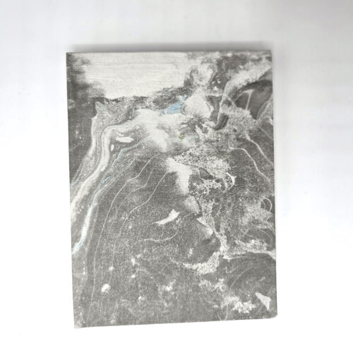
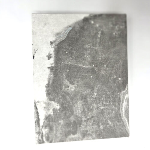
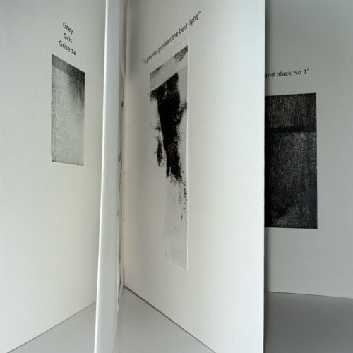
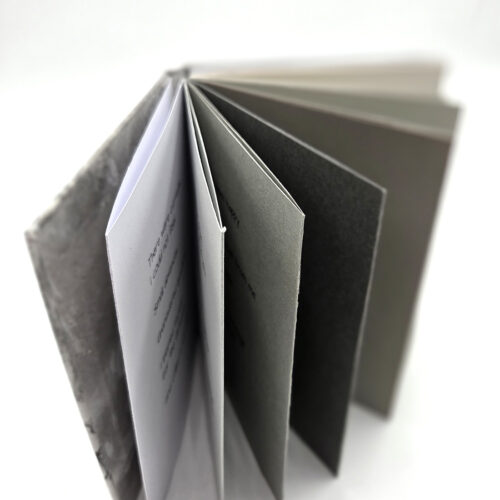
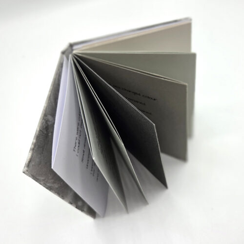
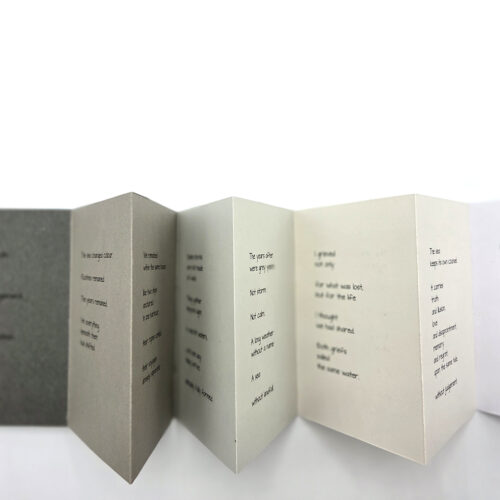
This book began with the suminagashi bookcloth and endpapers I printed during a course with Sue Doggett at City Lit. These prints sparked a continuing series of books inspired by the sea. Elements such as the Beaufort Scale, the Shipping Forecast and a ship’s log have become starting points for poetry and prose exploring the loss of a relationship and the fragility of memory.

When the theme Grey was chosen, I immediately thought of the sea in all its changing moods. I wrote a poem (which you will find here) to reflect the shifting emotions suggested by the different shades of grey paper.

The book is a concertina structure made from a range of grey papers, with boards covered in suminagashi-printed paper and Chinese shogi paper used for the endpapers. The quality of grey papers was dictated by time constraints, but their varied tones echo the changing colours of the sea.

Asymmetry

Joan


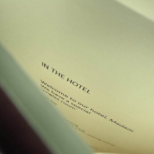
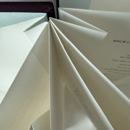
I have been making a second, updated, edition of my book  ‘Single Supplement’.

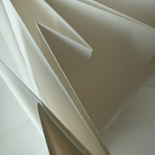
It’s about the experience of travelling alone and it is about the poor treatment meted out to solo travellers and people dining or drinking on their own. Hotels and shipping lines routinely charge guests extra for their stay in the smallest, most miserable, rooms and cabins – it’s known as the ’single supplement’. I have made an irregular concertina book because I wanted to have some narrow pages and hidden folds to represent the cramped, unpleasant places often reserved for solo travellers in hotels and restaurants. There is a distinct asymmetry, not just in the experiences of solo travellers/diners and couples or families, but in the power relationships between customers and hotel and restaurant owners. In 2023, the Café Royal in London decided to charge solo diners twice as much as they would normally pay, on the basis that they were losing significant revenue when people eating on their own took up a table for two.

Patti

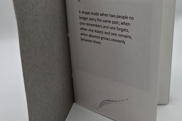
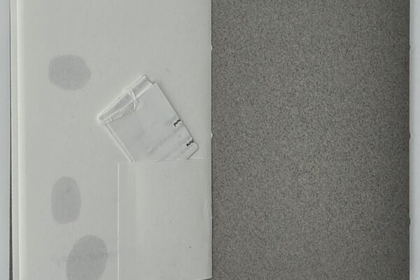
I decided to look at Asymmetry from a different perspective – that of relationships going awry. Based on my poem, Burn, it is scattered with text and hand drawn and photographic images, some distorted. The poem itself is folded and locked with a dagger enclosure (so it cannot be read without being detected) and held in a small pocket on the last page.

Dos-à-dos binding on Fabriano paper with Canson Mi-Teintes paper cover.

Tony

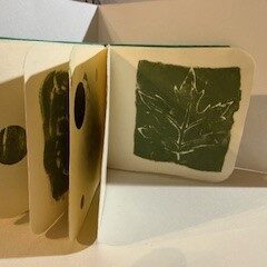
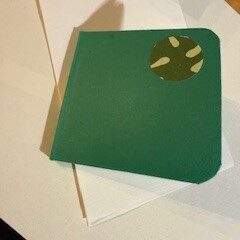
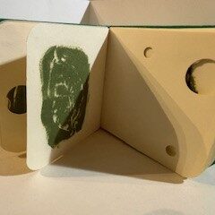
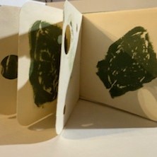
My asymmetry maquette is inspired by an image of a cocoa leaf found in an Inca tomb, part of half a garland and being half is asymmetrical. I combined this with the idea of time passing and the asymmetrical nature of life. 

When we’re young our bodies are almost invisible to us, as we age we become more aware of their dis/functioning – aches, pains etc. They become opaque.  The poem (which you can read here) discusses what is lost and what is gained as we grow older. One of the pages is pierced allowing the light and colours of the leaf to show through and gives the occasional glimpse of the handwriting on the page behind.  I used my own writing as it has a scrappy, asymmetric, feel with suited the theme.

The covers revealed a serendipitous connecting of enlarged hand writing which allied with each other as they were opened out. Tamar observed that the shape and colours made it feel like a historical artefact. Which was a very pleasing comment as a lot of my work revolves around found old objects.

Alison

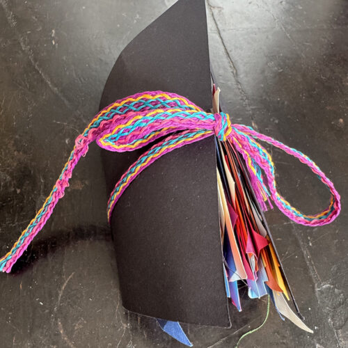
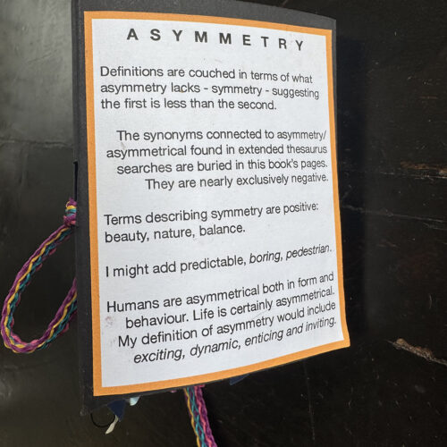
What could be more symmetrical then a traditional book format? For this theme I wanted to challenge that presumption and create a book that had asymmetry as its central premise. Buried in its pages are synonyms I found for asymmetry, which are often surprisingly negative. Why would asymmetry be considered a negative attribute? 

Isi

 For this month’s theme, asymmetry, I did not use any words in this artist book. A first for me, even if I generally work on themes around discourse!  This time I challenged myself to illustrate this theme by drawing asymmetric shapes mixed with collage.

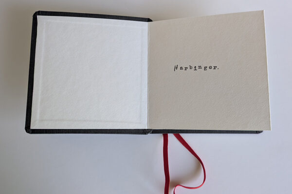
Harbinger

Isi

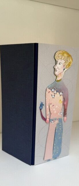
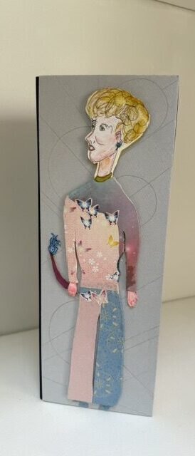
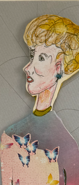
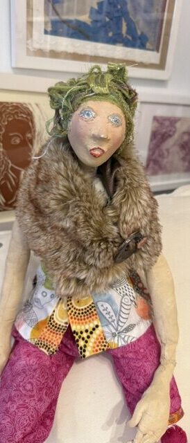
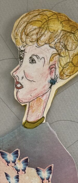
For the theme “harbinger” I chose Carlotta, a central character in one of my sci-fi stories. Carla, Carlotta, auntie, is a psychic, intergalactic podcaster, who likes to protect the children of Oberland.

She is unique, brave and leads in my story as a precursor as well as a messenger bringing together understanding for the Orbitants, should they feel ready to deal with their past to build their future. This character appears in many of my arty projects and is based on one of my grandmother’s friends who had a little pointed nose and eyes looking always beyond our physical reality.

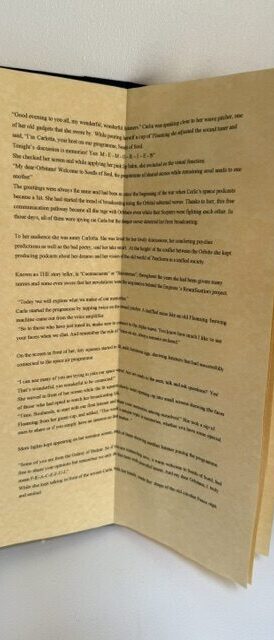
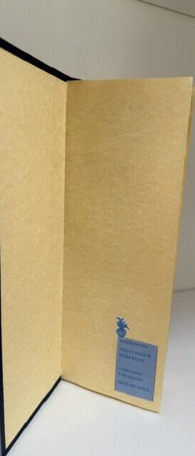
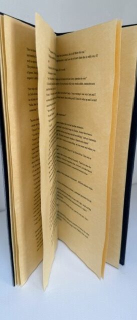
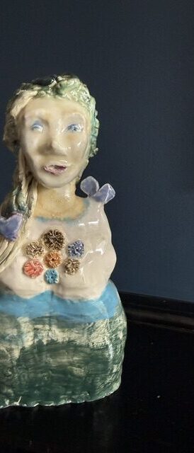
Here are illustrations of Carlotta as part of my artist book, but also as a ceramic and as a fabric doll . As you can see, no master pieces but great fun to create and make.

Joan

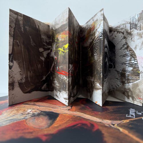
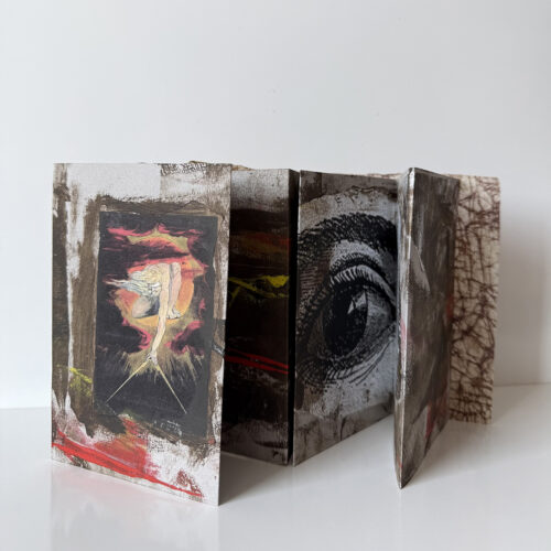
My book for this month’s theme, ‘Harbinger’, was based on William Blake’s Europe: a prophecy (1794). I love the way in which Blake combines text and imagery in his work and the subject matter of this particular book is so relevant to the theme. In its day, Blake’s book was a brave critique of the Enlightenment’s promotion of science, logic and mathematics, at the expense of human imagination. He criticised the impact of organised religion for restricting spiritual freedom and the imposition of inflexible ‘laws’ and he parodied Freemasonry and the idea of God as a benevolent designer. It was not a prophecy in the sense of predicting the future, but an analysis of European society and beliefs as he saw them at the end of the 18th century.

My book is a simple concertina, with mono print and bound in a soft cover of waxed paper.

Patti

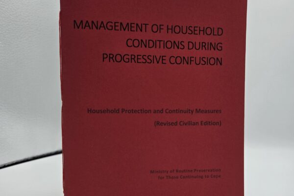
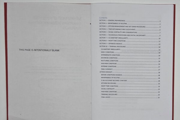
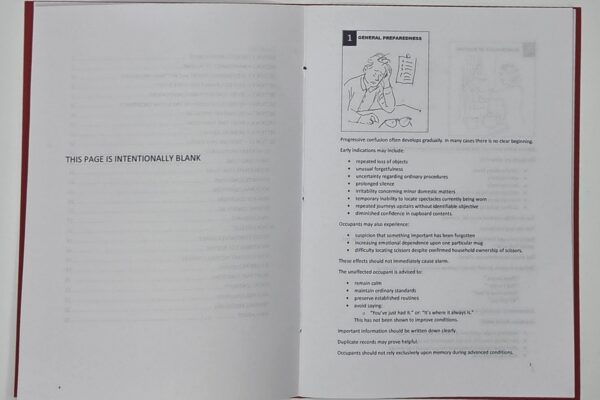
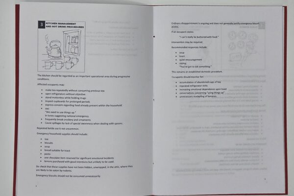
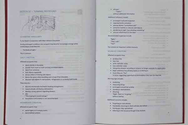
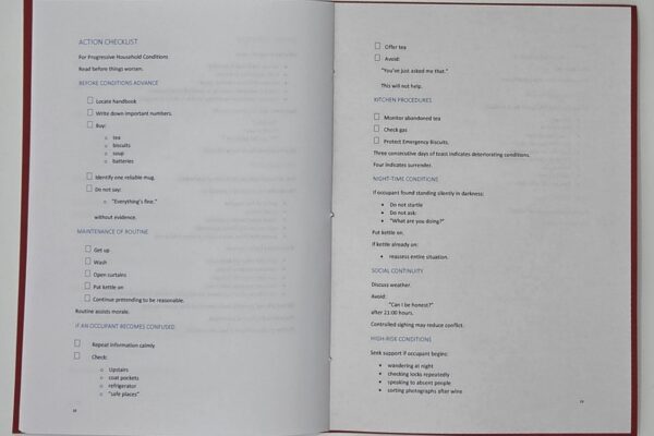
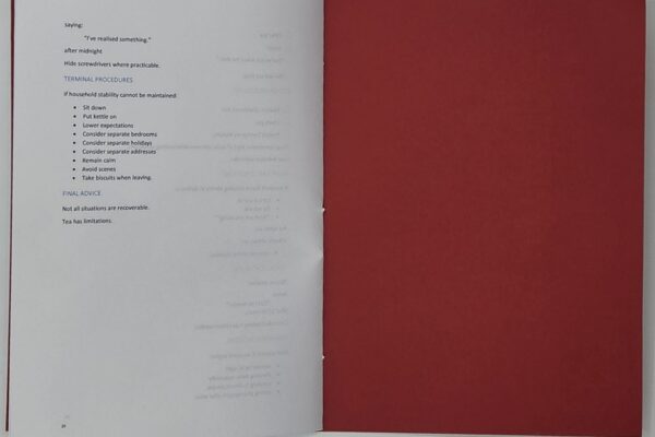
I thought about Harbingers of Doom, and warnings, and recalled the government publications about how to survive a nuclear attack. I imagined the siren going off and people searching, wondering, “Now where on earth did I put Protect and Survive?”. I made a spoof on this booklet talking about how to survive living with a person behaving strangely: absence, chaos, and leaving – and it’s very tongue in cheek.

Pamphlet, inkjet printed on Fabriano, Canson Mi-Teintes cover.

Alison

|My book entitled Omens, Superstitions, Charms and Old Wives’ Tales conveys this small collection in a completely graphic style. This creates a bit of a guessing game, easy to solve as we are all so familiar with each one. 

Gill

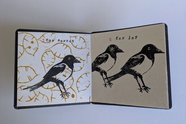
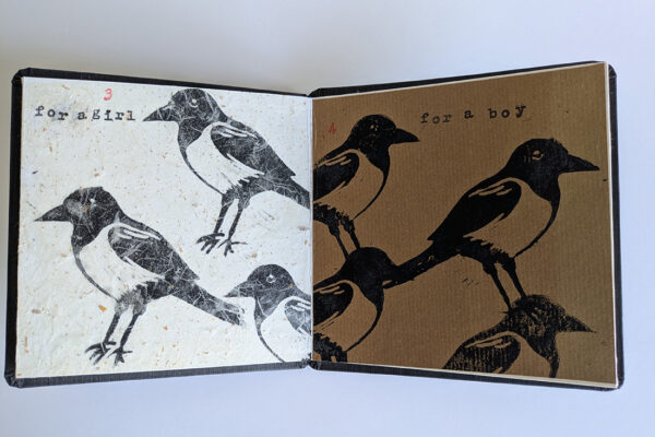
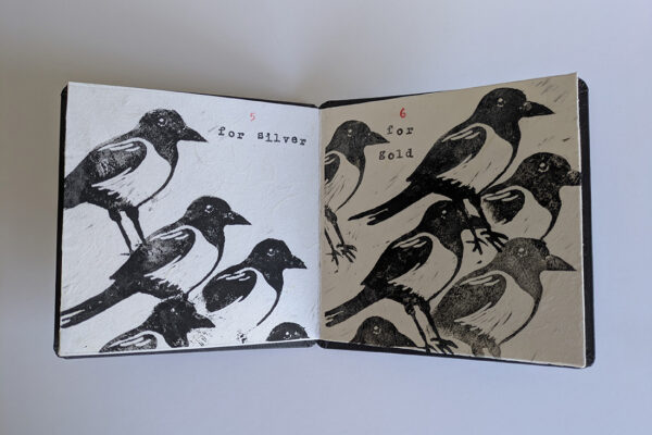
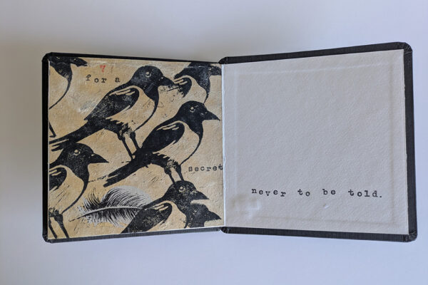
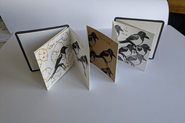
For this months theme of Harbinger I chose the Magpie as a Harbinger of bad luck, using the well known rhyme…. 1 for sorrow….etc.

I cut the magpie out of lino then hand burnished the image onto a variety of papers. I used an already made concertina book.

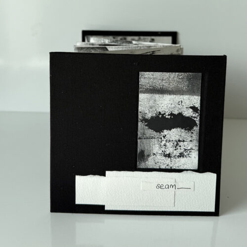
Seam

Isi

For Seam, this month’s theme, I wanted to stitch paper with coloured threads as the representation of suture. The printed patterns used symbolise our cells how they repair, mend, evolve and come together to create life and energy.

Joan

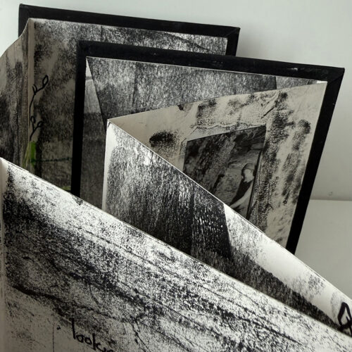
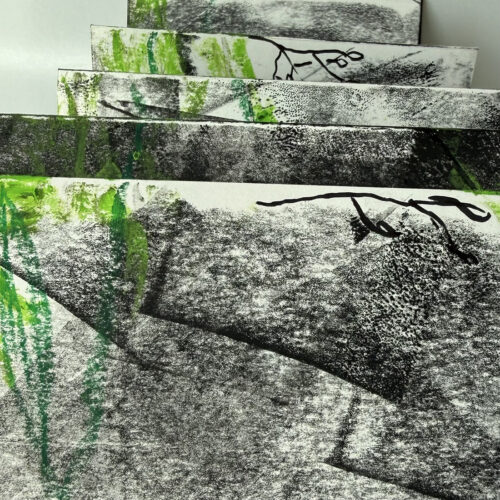
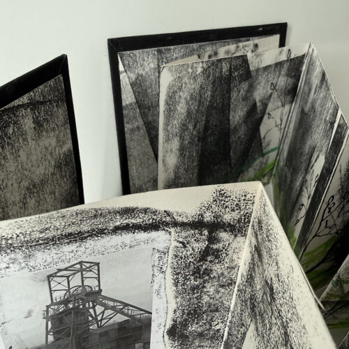
When I was a child in West Yorkshire, most of the men in the village worked in the mill or down the pit. The main seam of coal running through the area was the Barnsley Seam and there were dozens of pits of varying sizes.

I have tried to capture the darkness, filth and danger of the whole mining industry in this book. It was an important source of employment and many of the old pit villages were devastated when the pits closed down, but it was a hard life.

I have used trace monoprint and oil pastels, as well as collage.

Patti

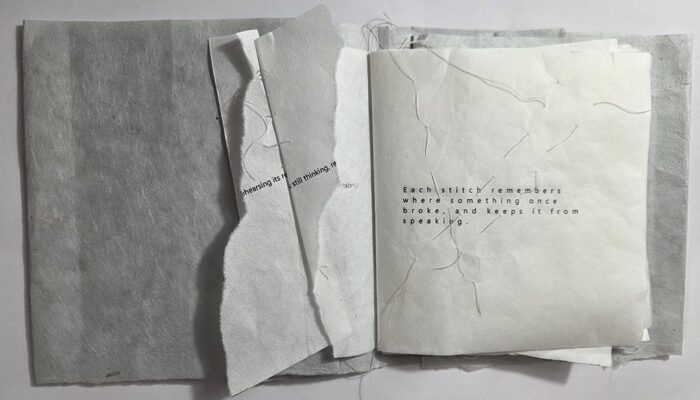
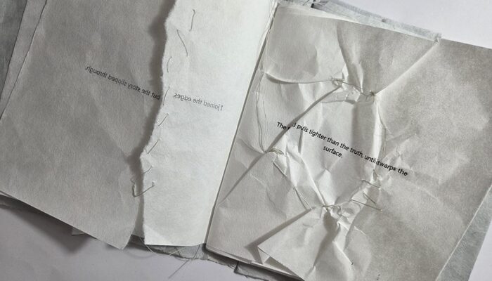
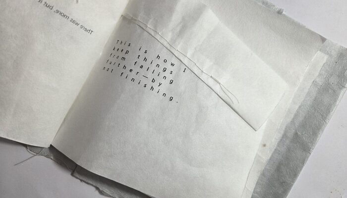
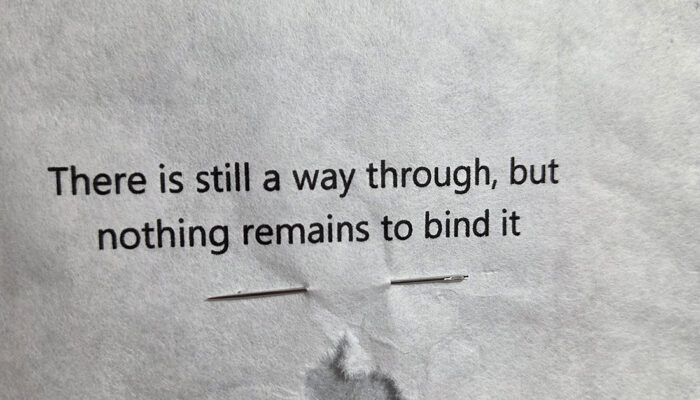
Seam examines joining and repair through repeated stitching. Each page uses piercing and thread to connect paper, but the repetition gradually weakens the material rather than strengthening it. The work does not aim for a finished or stable outcome. Gaps remain, threads pull unevenly, and the surface shifts. The text follows this process, describing attempts to hold, organise, and complete something that does not fully come together. Seams mark points of breakage while also trying to contain them. The book returns to these points repeatedly, without resolving them into a final, fixed form.

Pamphlet binding with folded cover in handmade paper (concealing a message). Inside pages from Japanese Shoji Gami paper, white cotton thread, typed text, hand stitching.

Tony

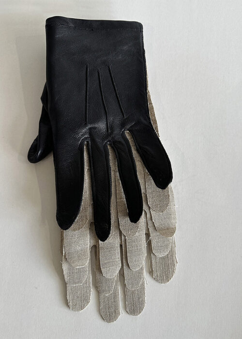
I love to use found objects in my work. 

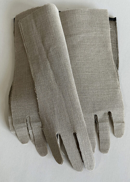
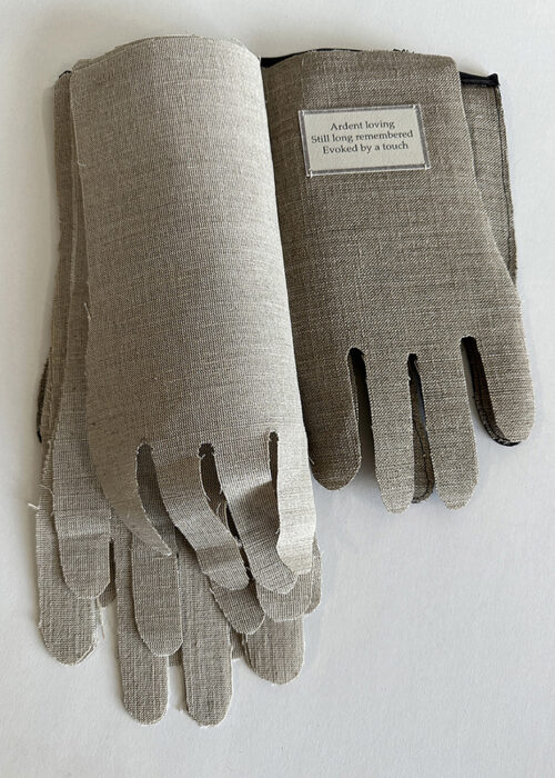
As my sewing skills are meagre I decided to use this orphaned glove for the theme ‘Seam’. Mainly because it involved unpicking rather than sewing.  I love the three raised seams on its back of the glove, I don’t know the significance of them is but they are very satisfying. I liked the contrast of the supple glove leather and the linen stiffening I used to create the pages of the book. They feel like memories of the things the hand in the glove has touched.

On the penultimate page I sewed I the following haiku. 

‘Ardent loving
Still long remembered
Evoked by a touch’

Gill

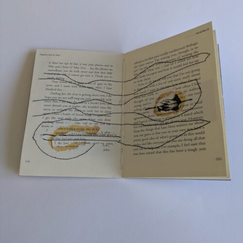
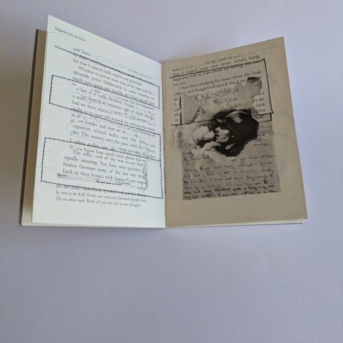
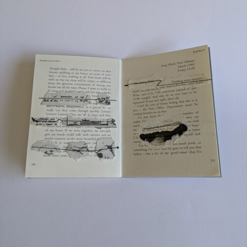
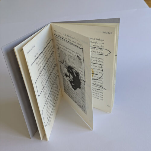
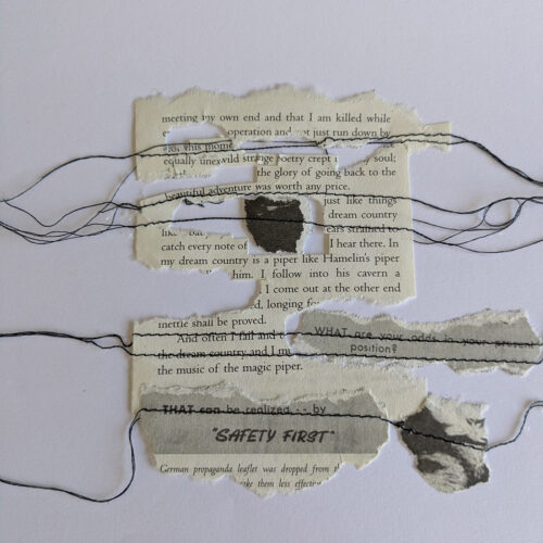
For the topic of Seam I chose to explore the idea of stitching words together. I de-constructed pages from a book, tearing and ripping holes in the pages, removing words from the narrative and placing them on different pages. I stitched the fragments back together using black thread onto dissolvable fabric. I then stitched the pages back together to make my own book. The book is not intended to be ‘read ‘.

Dawn

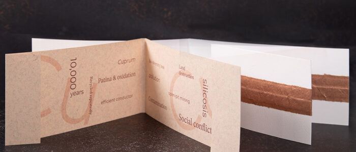
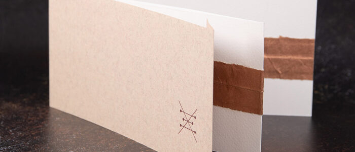
This month’s theme inspired two book ideas. Firstly, geological. A seam of copper. Such an important mineral in so many ways but there are also consequences for how it is being mined. I kept this simple, a wraparound cover and a literal ‘seam’ made from stitched copper Lokta paper.

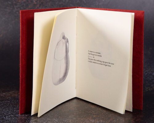
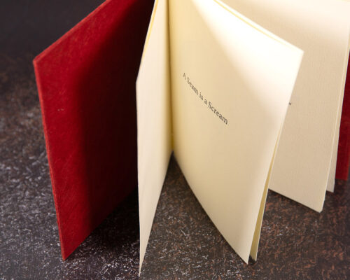
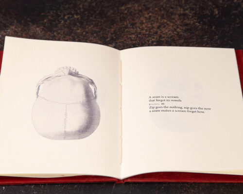
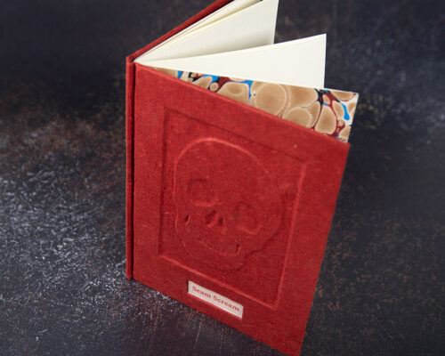
Seam scream, came about as a word association game based on the theme. It took me to the seams (usually referred to as sutures) in our skulls. I wanted the book to have the appearance of an abandoned dusty old tome perhaps found in an antiquarian bookshop or Hogwarts library. The Dadaesque narrative is like a book of spells. It finishes with the lines – ‘but every body is made of seams.’

Collaboration – miniature books

One of the founding principles of London Artists Books was collaboration and mutual support. We meet monthly to share our work on that month’s ‘theme’ and to plan joint activities, which include sharing skills and information.

Early in 2026, we completed a project, producing miniature artist books. Tamsin @tamsin_james inspired us, with her gift of putty rubbers and Gill @gill.jenkins.969 provided some one inch square examples of how we might approach the challenge. As always, although we were working independently to the same brief, the outcomes were all different and fun.

The artists who took part were: Tamar Balakjian, Tony Broad, Wendy Falconer, Joan Higgins, Tamsin James, Gill Jenkins, Isi Marcoul, Alison Payne and Patti Taylor

Green

Joan

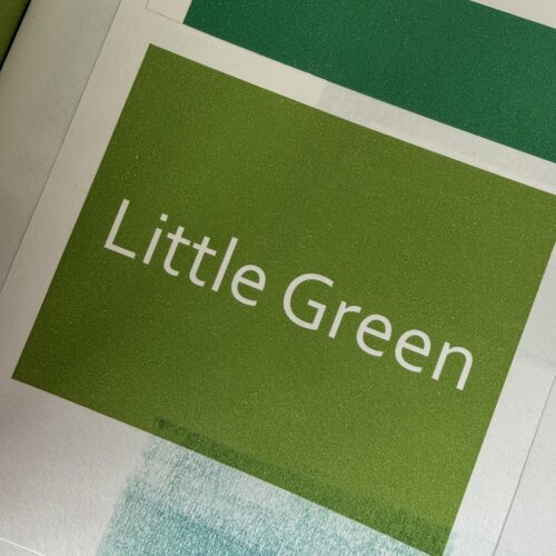
My book for this month’s theme, ‘Green’, was a celebration of Joni Mitchell’s song  ‘Little Green’  written 60 years ago, in 1966. She wrote it for her daughter, Kelly Green, who she had given up for adoption the previous year. She was an impoverished young folk singer, unable to provide for her new baby. The song is poignant, loving and hopeful.

Patti

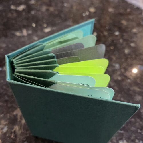
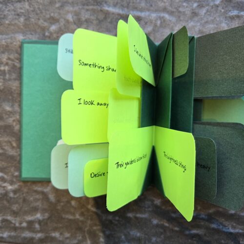
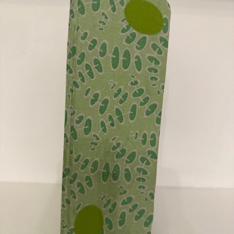
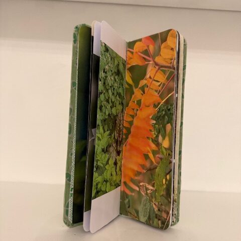
As my colleagues know, I wasn’t much taken with this month’s theme … but I discovered that working on an almost unloved topic challenged me and I had to work harder. I ended up very happy with this little blizzard fold book with inserts in a Belgian binding. All the papers used, including the cover, have been recycled.

I looked at the various connotations for green: new growth, jealousy, bruising, and regeneration, and wrote a few words on each topic.

Tony

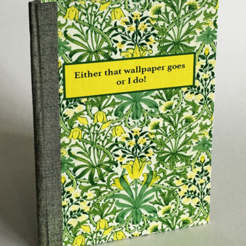
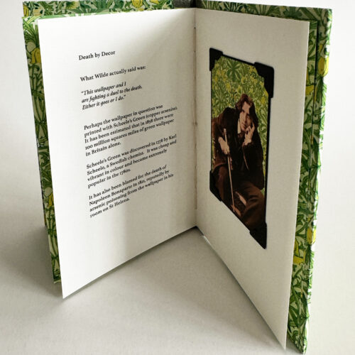
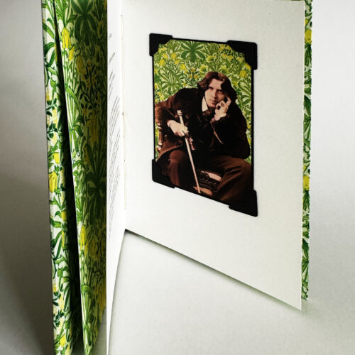
Death by Decor

What Wilde actually said was:

“This wallpaper and I are fighting a duel to the death. Either it goes or I do.”

Perhaps the wallpaper in question was printed with Scheele’s Green (copper arsenite). It has been estimated that in 1858 there were 100 million squares miles of green wallpaper
in Britain alone.

Scheele’s Green was discovered in 1778 by Karl Scheele, a Swedish chemist.   It was cheap and vibrant in colour and became extremely popular in the 1780s.

It has also been blamed for the death of Napoleon Bonaparte in 1821, reputedly by arsenic poisoning from the wallpaper in his room on St Helena.

Wendy

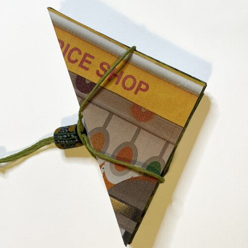
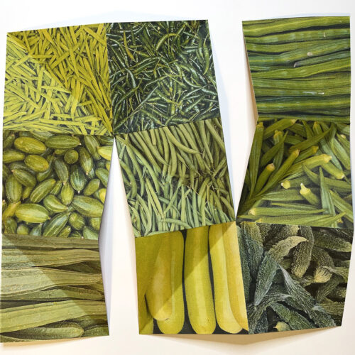
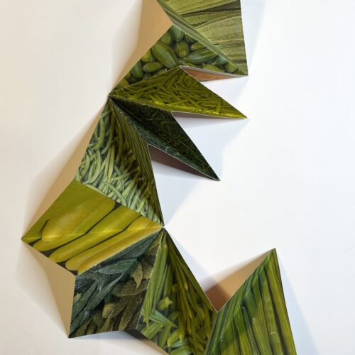
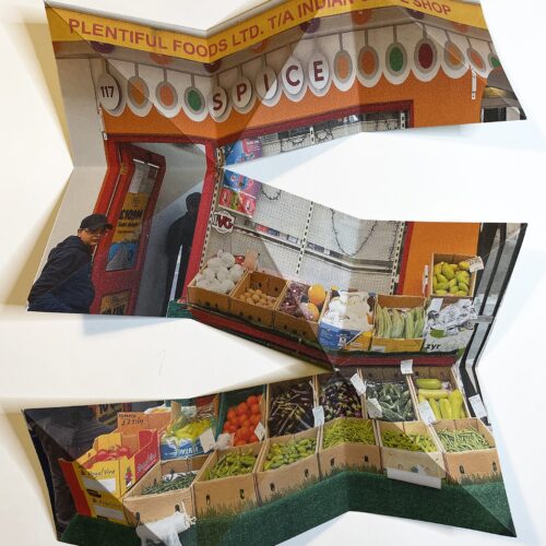
For the theme of Green, I was struck by the colourful array of vegetables outside the Indian food shop on Drummond Street. The geometry within the display suggested the book format.

Alison

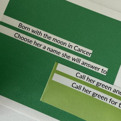
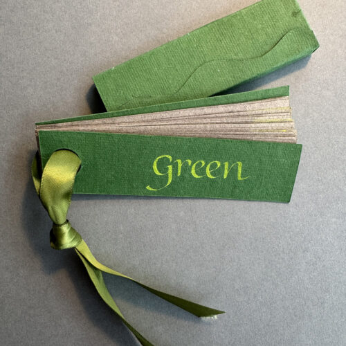
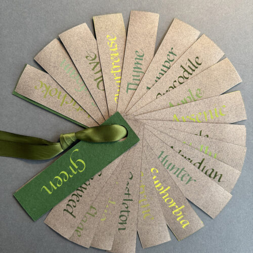
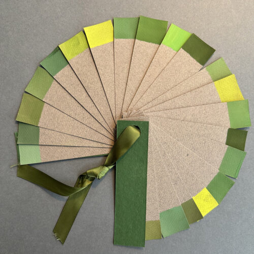
I  found ‘Green’ a particularly inspiring theme and couldn’t help but produce 2 books. The first is purely an exploration of various names for colours of green. I’m fascinated by people’s varying interpretations of colour names and so chose more unusual examples and my own versions. You can turn the book over and play a game trying to guess the colour names as well. 

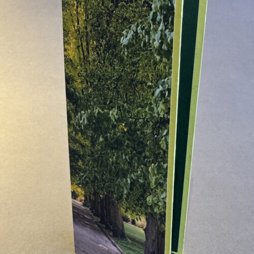
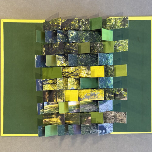
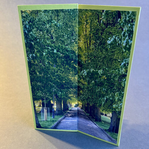
The second book is a flag book made up from a photograph I took at Alexandra Palace Park and interspersed with different greens found in that photograph. The cover is another shot also from the park that comes together when the book is spread open. 

Isi

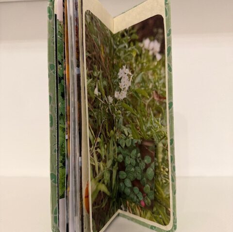
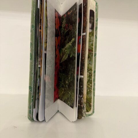
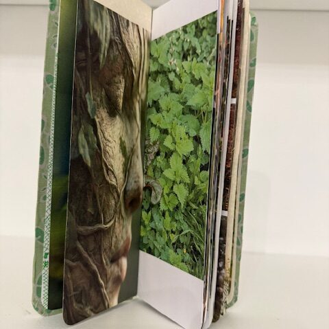
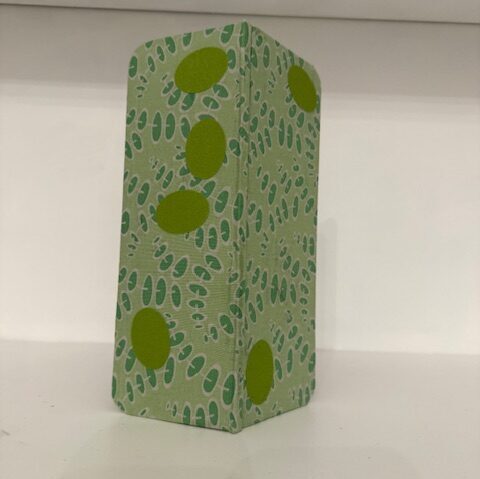
My walk to my local station can be very repetitive so I often take photos of plants, flowers and weeds imagining surreal creatures living in them to entertain myself. So, for the theme “Green” I wanted to use some of these photos and an imaginary “green man” surrounded by green plant spirits! 

Time

Patti

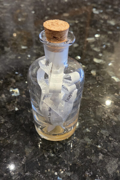
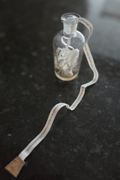
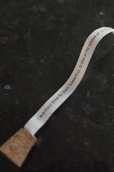
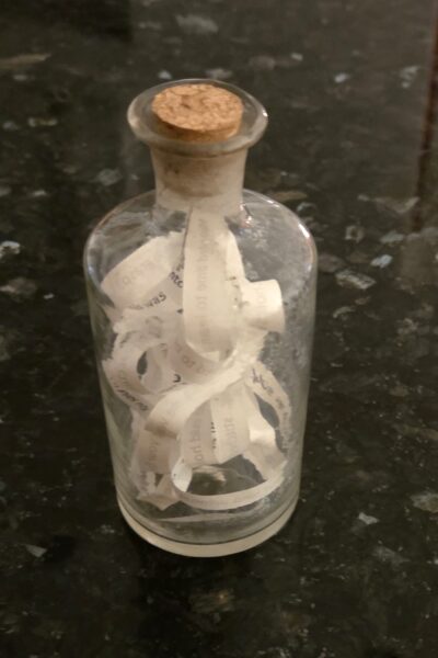
With this theme I was taken back to a song that was important to me as a young, romantic woman—Jim Croce’s Time in a Bottle. I’ve become more cynical over the years—time passes and dreams become disappointments—reality steps in. I’ve written a new version and again, time is in a bottle.

Inkjet print on bible paper held in vintage apothecary bottle.

You can read the text here.

Tony

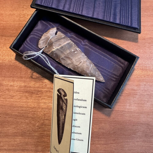
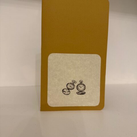
Thinking about the prompt ‘Time’, I wanted to use a found object that embodied many layers and descriptions of time.  For me this knapped flint spearhead does exactly that.

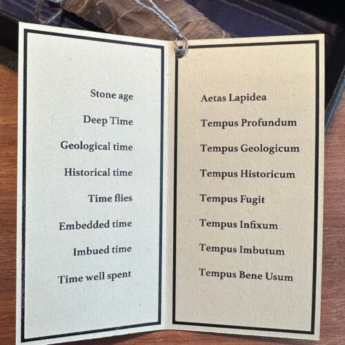
I decided the most effective way to draw attention to the idea was to form a list of references to time. This would allow people to think around the range and scope of theme.
To echo the work and time involved in creating the spearhead I created a luxurious padded box to contain the flint. The end result feels like an object that belongs in a cabinet of curiosities. I translated the list into Latin, referencing how knowledge was kept behind a linguistic firewall when Wunderkammer were at the height of their popularity in the 16th Century.

Alison

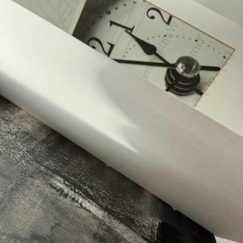
For our theme ‘time’ I wanted to reflect on the sequence of stages throughout the day. Gathering terms to describe each one, I matched them to sky colours for each hour in a twenty-four-hour cycle. The waterfall format reflects the repetitive nature of this rhythm.​

Gill

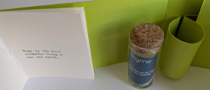
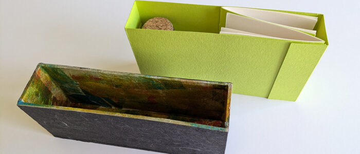
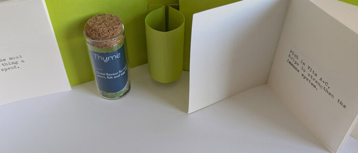
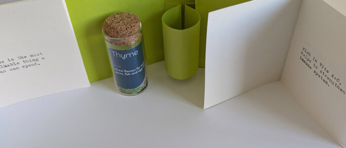
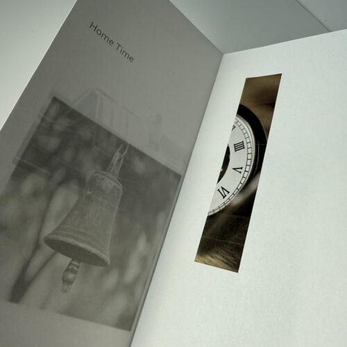
For the theme of Time I made two small books: one that contained quotes about Time, and the other contained facts about the properties of Thyme, the herb. In the centre of the construction is a small bottle which contains some Thyme seeds. The vessel is intended as a time capsule for future observers.

Isi

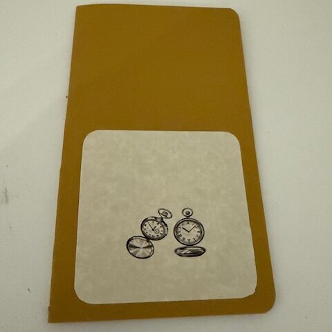
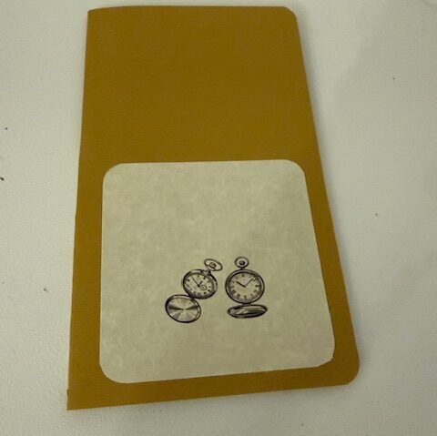
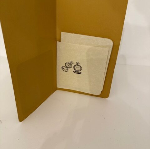
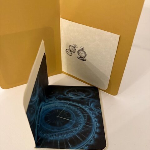
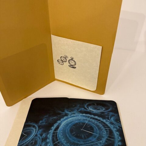
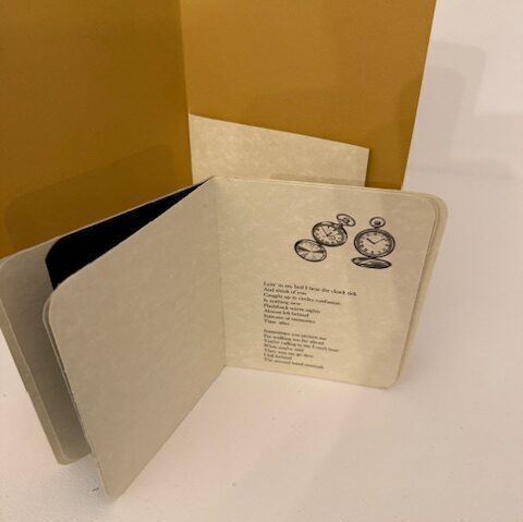
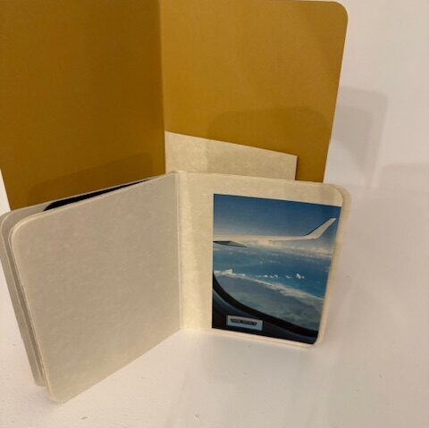
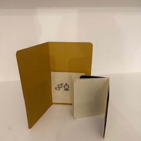
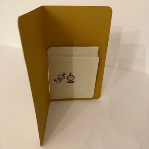
For the theme  “Time”. I designed this simple pocket to host a small pamphlet book.

To illustrate the notion of Time I used text based on the  lyrics from two songs. One is “avec le temps” a very moving French song made famous by Leo Ferre, the other is “Time after Time” by Cyndi Lauper, which reminds me of the deep love, loyalty and loving we, human beings, can feel towards other human beings year after year.

I also chose prints of a watch that reminded me the one my granddad had. Nothing better than Granddad who was timeless and finally a photo of a plane as a time when my husband had to fly back and forth from London to the US every week as a symbol of our enduring love.

Joan

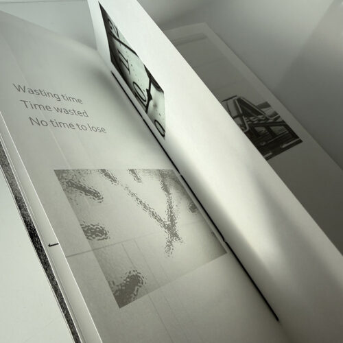
This is a simple pamphlet book, with laminated printed covers. It includes collaged images and pen and ink. I made the book because I was thinking of the very abstract notion of time. Although it can be measured precisely, the sense of time – and time passing – is a very subjective experience. I was also curious about the notion that time can be ‘owned’ – that I might be wasting or saving  ‘your’ time or my own time. This book doesn’t remotely do the subject justice but it is the beginning of something I might develop further.
A line from a book

Tony

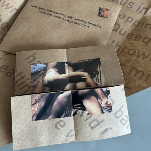
The theme of choosing a line from a book that meant a lot to me instantly made me think of a sentence from Moby Dick by Herman Melville. I read it when I was about 11 or 12 years old and the sentence 

Queequeg now and then affectionately throwing his brown tattooed legs over mine’’ hit me like thunderbolt.  

The idea was shocking and exciting at the same time and the scales fell from my eyes. It became a sort of code. Have you read Moby Dick was no longer an innocent enquiry.

I thought the flexion structure was ideal to convey a tumult of emotions and of course all pornography should arrive in a brown paper envelope!

Alison

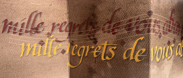
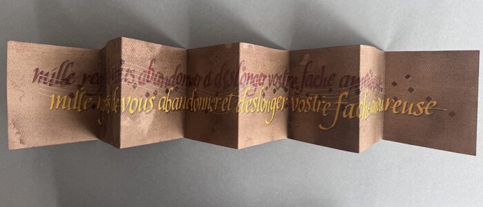
I have been grappling with lines from Mille Regretz, a 16th century chanson attributed to Josquin des Prez, for several years now and thought I would have another stab at it. Trying to convey the feeling of multiple voices singing these beautiful and meloncholy words that float through a space (given the work would have been performed in a church) has stumped me. I have tried some three dimensional approaches and now this purely calligraphic piece, but very much stil working on it. 

Gill

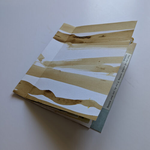
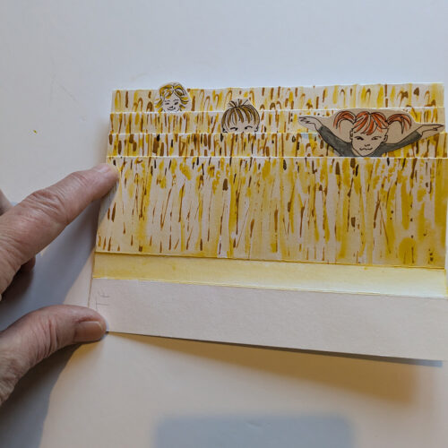
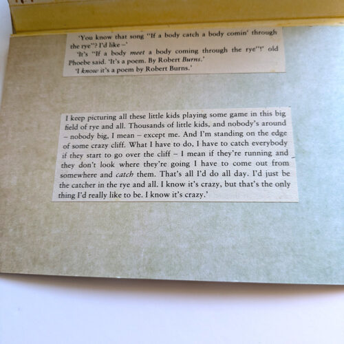
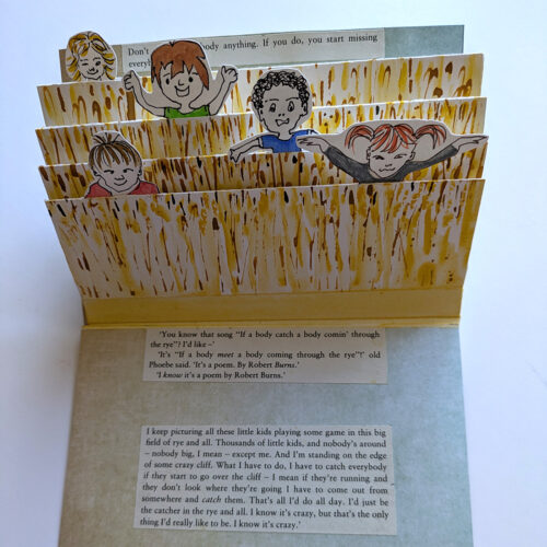
“Don’t ever tell anybody anything. If you do, you start missing everybody.” Catcher in the Rye.

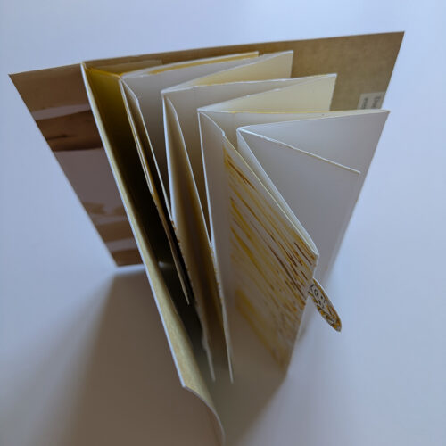
Fishtail method construction with popup children.

Isi

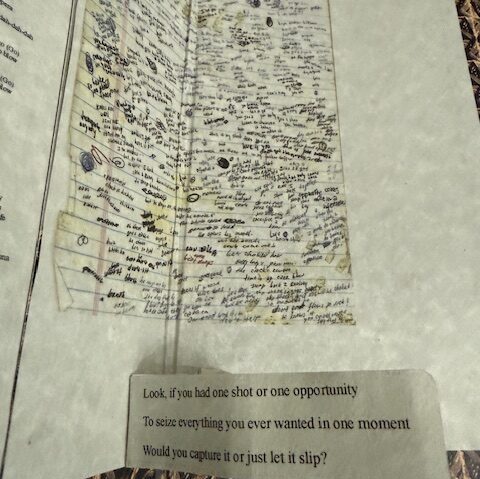
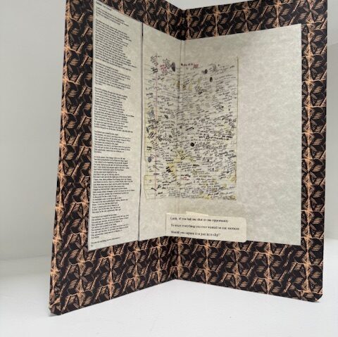
 For the January theme “One line from a book” I chose the lyrics by Eminem from his song “lose yourself “
“Look if you had one shot or one opportunity
To seize everything you ever wanted in one moment
Would you capture it or just let it slip?”

I particularly like this song for its tempo and obviously its great lyrics that build this growing sense of pressure, emergency and how our lives can change, in an instant, after one opportunity.

It’s an illustration of how life and our decisions slowly paint the full picture of our existences.

Joan

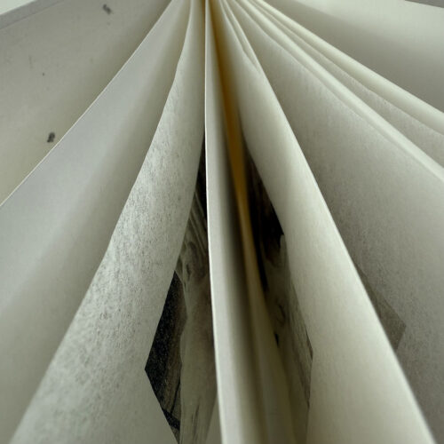
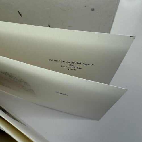
My response to the LAB theme in January was to make a book in response to Philip Larkin’s poem, ‘An Arundel Tomb’. I have always felt very moved by the final line  “what will survive of us is love”. There are many interpretations of what Larkin intended by this line. He was not a sentimental figure. For me, it is a hope and aspiration – that when we leave this world, we will be remembered for the love we shared and not by material success. The book contains images of the 14th century tomb in Chichester Cathedral, of the Earl and Countess of Arundel, with the couple lying side by side holding hands. The cover of the book is a delicate Korean paper.

Patti

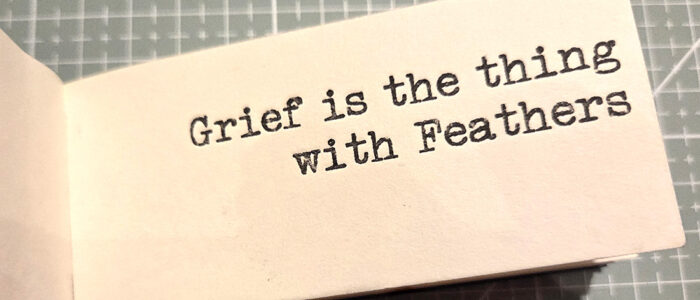
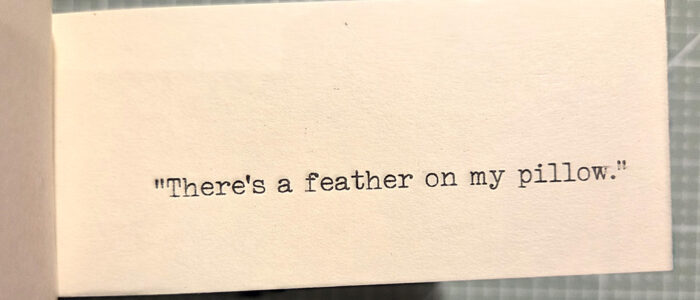
A book which had a very powerful affect on me and was there when I needed it, just after my mother died, is Grief is the thing with feathers by Max Porter (I was also lucky enough to see the play at the Barbican, starring Cillian Murphy).

The opening line is simple: “There’s a feather on my pillow” – and so it began.

I made a small, soft covered, flip book with perfect binding, showing how the feathers mounted up every day, until the pillow was almost black.

Holy/Holey/Au Lait

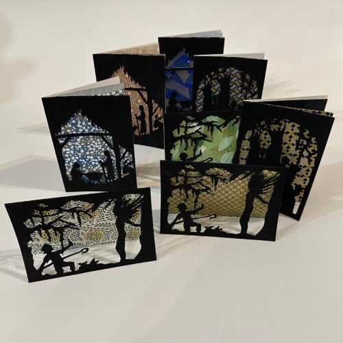
Tamsin

Prompted by our proximity to Christmas, I decided to create cards taking scenes from the nativity. I used the cut-out format, which challenged me to produce images that were readable in silhouette form and could be held up within the frame of the card – holey, as well as holy!

Tony

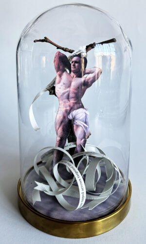
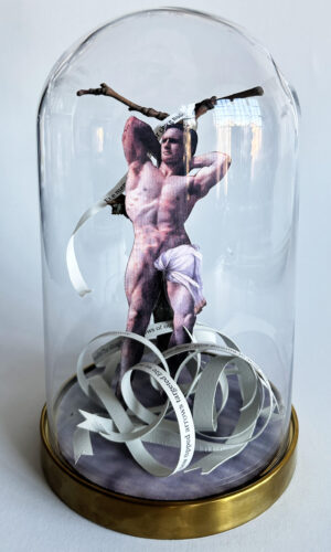
Using our theme Holy as a starting point I continued working on my reliquary project and decided to celebrate St Sebastian.

I enjoyed choosing the body builder image for this work, his impassive, distant gaze echos the demeanour of Sebastian seen in Renaissance works. Rather than depict the actual arrows I used several quotes to reference his martyrdom, including Basciami mill volte, by Luca Marensio  ‘Et e men disarmato all’hor che e nudo’… ‘And is best armed when he is nude’, which I heard performed by Musica Antica last month.

It seemed fitting to me.

Alison

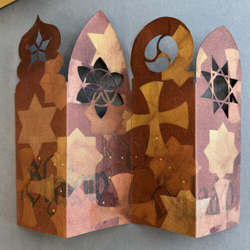
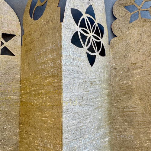
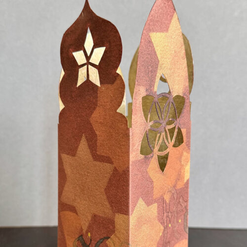
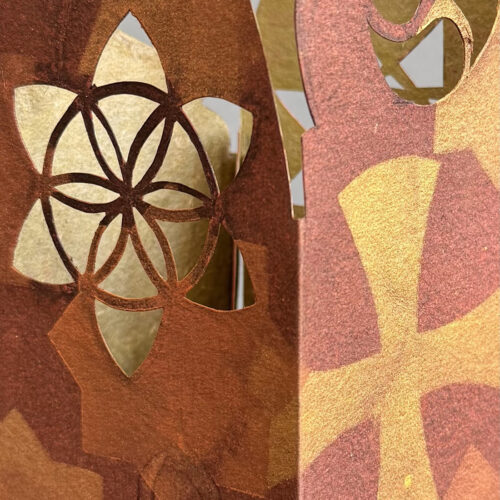
For the theme Holy Holy I have created an architecturally inspired ‘book’ covered on the outside with symbols and the Arabic, Hebrew and English words for Peace. The interior is covered with excerpts from prayers from Christian, Judaic and Islamic texts. Folded up the piece can illuminated from within with a candle. The hand-cut ‘windows’ are holy and the message is both holy and hopefully hopeful. 
Gill

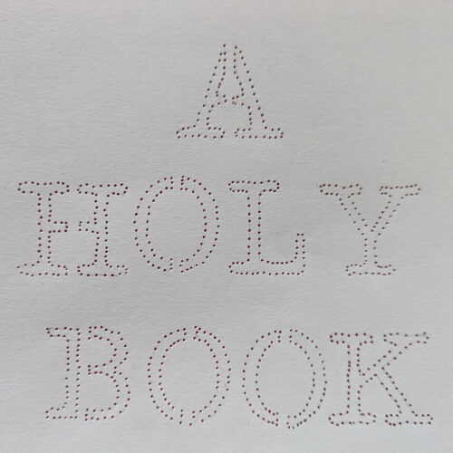
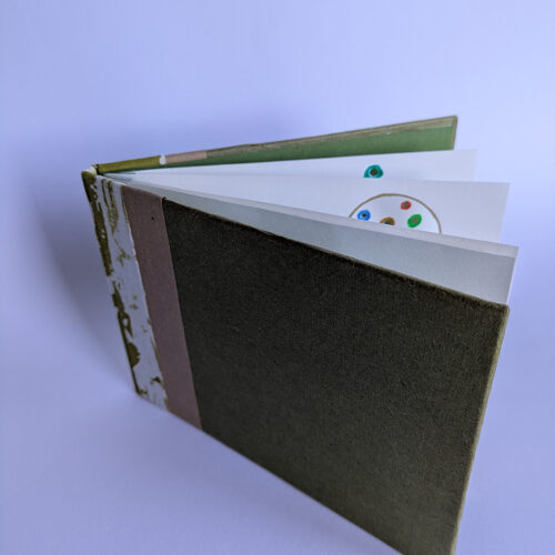
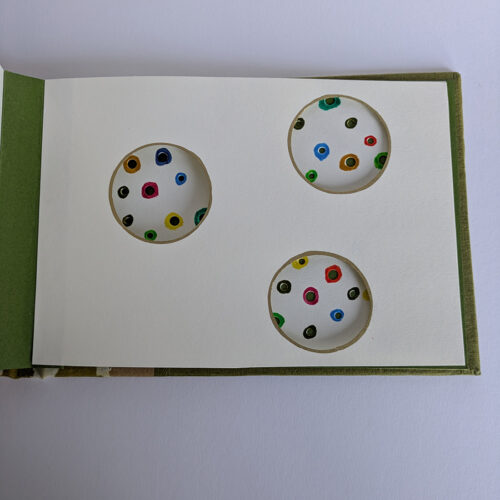
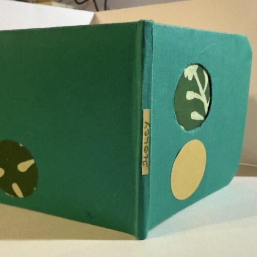
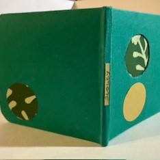
I decided to make a ‘Holy Book’, not a religious book but one I made from holes of all different shapes and sizes. 

Isi

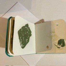
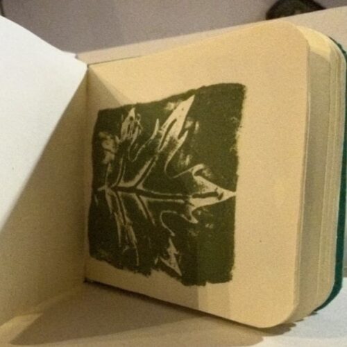
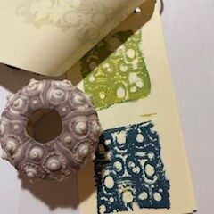
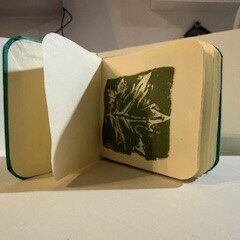
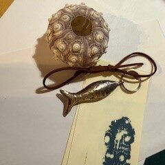
For the theme “holly, holey, holy, au lait” I chose to print autumn leaves on to small sheets of paper using a drawing putty square, and played around with notions and representations of holiness/holly, nature and space. 
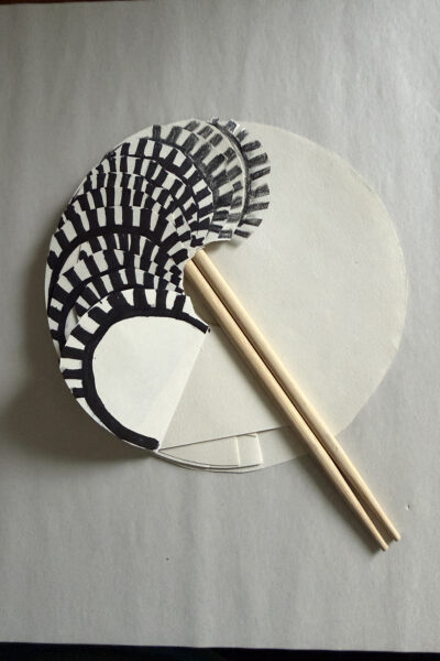
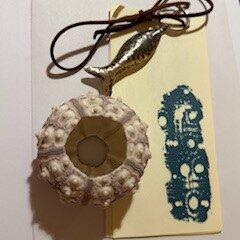
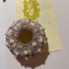
I also used the putty to make prints with an urchin shell. 

The idea was to have two forms of prints bringing together earthy and aquatic items, my way of illustrating a holy combination of earth and water. With the urchin prints I also add a metal fish as the symbol of the Christian identity, iktus/Ichthys. 

Joan

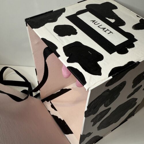
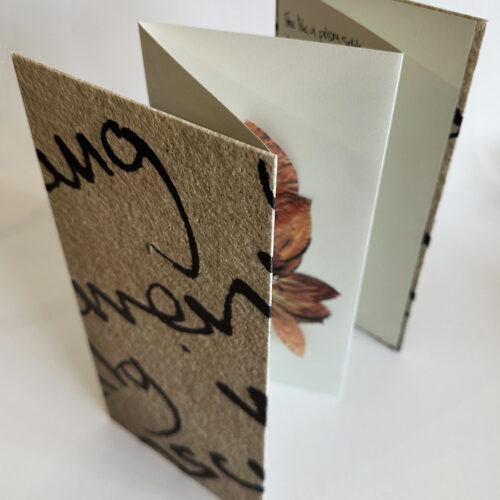
Here’s a cheeky little piece I made for our monthly meeting. It is called Au Lait and, hopefully, speaks for itself.

It is a not very well made box and was just meant to be a fun response to the month’s theme.
Patti

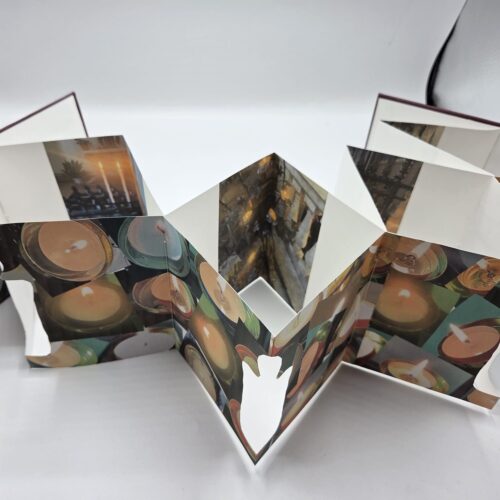
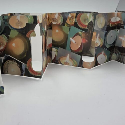
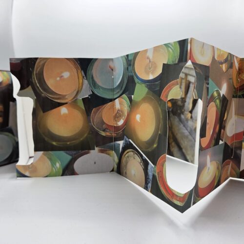
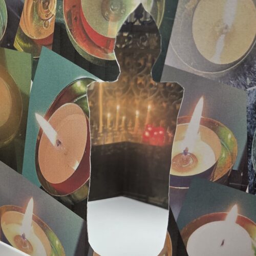
Since my daughter contracted meningitis on Mother’s Day 2024, a dear friend has lit a candle for her at Saturday Mass. If he has his phone with him he sends me a photo. I gain comfort from the strength of his faith and in his kindness. (After my recent very painful knee surgery he has lit a candle for me too.)
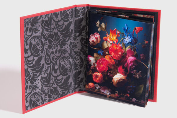
I have made a “Holy” “holey” book using some of the candle photographs on the front concertina. A cutout in the shape of a candle allows a view of the rear concertina which has photographs of votive stands in various churches he has visited.

Tamar

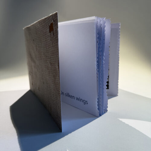
On silken wings the moths are never sated.

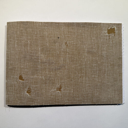
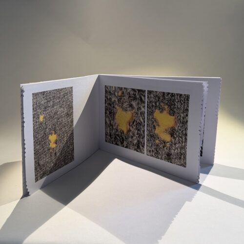
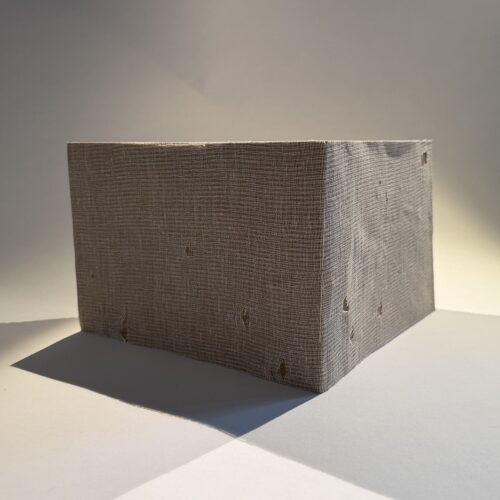
With clothes moths as my creative collaborators (try not to cry), this work documents every moth hole in one of my  jumpers.

Each double page spread has a photo of the hole and then a close up.

I textured the foreedge using pinking shears to make them look nibbled. 

Muslin, book cloth, cartridge paper, layout paper, waxed lined thread

Blank

Tony

The prompt ‘Blank’ made me think of how some people hate the first blank page of a new sketchbook or a blank canvas.  In fact it is called ‘White Page Syndrome’.  Artists sometimes scumble the canvas to get rid of the glaring empty canvas and then imagine what the random marks suggest, a process called Pareidolia.

This made me think of the largest of all canvas, the starry sky.  People have, seemingly, always seen gods and monsters shining down on them. I constructed this interlocking concertina book with a blank page intersected by the Milky Way to echo our endless ability to fill in the blank space.

Gill

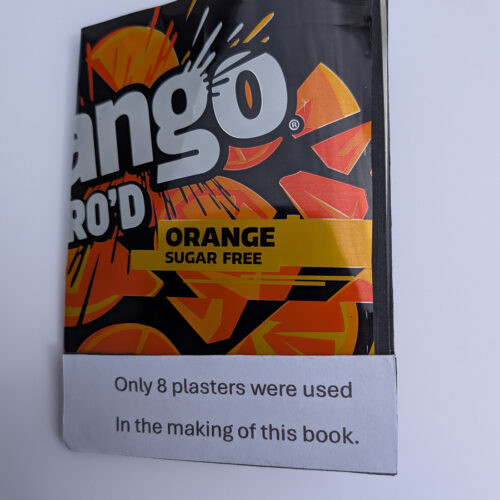
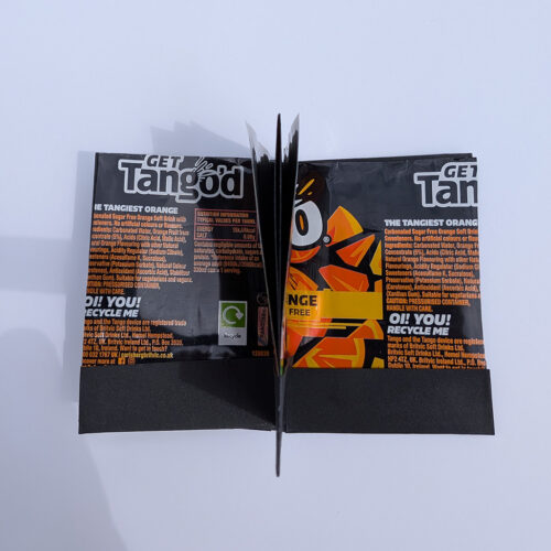
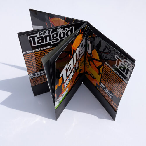
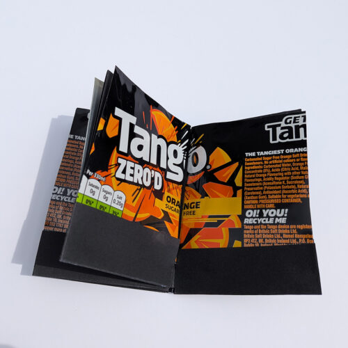
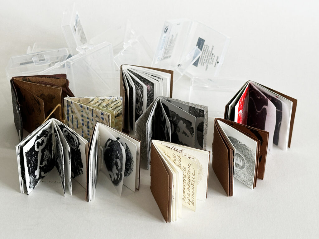
For this month’s theme of ‘Blank’ I created eight small stitched books, each one with different types of paper. The books are very small and relate to a project that we have concerned with taking impressions and then prints from putty rubbers that Tamsin gave to each of us. The books fit inside the plastic case that the putty rubber came in.

Isi

For the theme Blank I chose to use a paper structure that can hold several folded sections, each containing a letter of the alphabet creating together the word BLANK. It was an invitation to use a yellowish paper strong enough to keep the structure stable,  and transparent sticky notes with a very discrete grid on both sides of the cover giving an overall clean blank look to the book.

Joan

As book artists, we often discuss whether a piece of work, which may be book shaped but without text or a narrative, is really an ‘artist book’.

I tend to think that every artist book should have a narrative and a meaning to the artist, even if it is implicit. Although I like the colours in this ‘blank’ book, which I made for our latest theme, it has no significance to me as an artist book.

Patti

I made a small book in a white cover with photographs of me from childhood to now, gradually getting fainter through the pages until the last page is blank, to reflect on the fading of life into nothingness. I know, I know!

Tamar

I am currently exploring my Armenian heritage and identity. This book is the starting point of an embroidery work, the blank canvas.

Each page is buttoned in making loose sheets that can be displayed separately, reorganised, or read like a book.

Thanks to Louise Bourgeoise whose cloth books helped me to figure out how to make this. 

Calico, cotton thread, faux horn buttons